Available for full-time Art Direction roles, agency placement, and select freelance projects · Get in touch
Art Director  ·  Brand Strategist  ·  Bengaluru, IN
Art
Director.
From fine art to brand systems to advertising — H.P. Shivaraj
176%
Revenue Growth
15+
SKUs Designed
4+
Years Commercial

Most health brands look like pharmacies. I make them look like they belong in a kitchen.

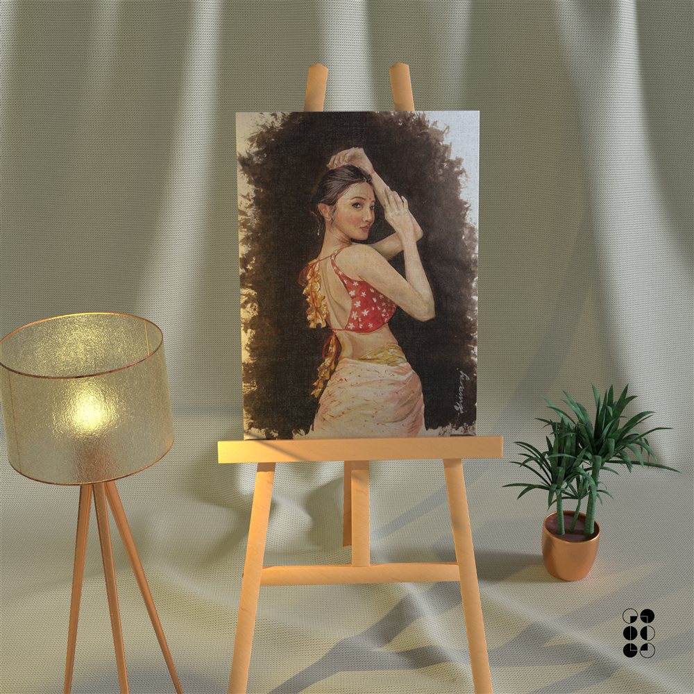
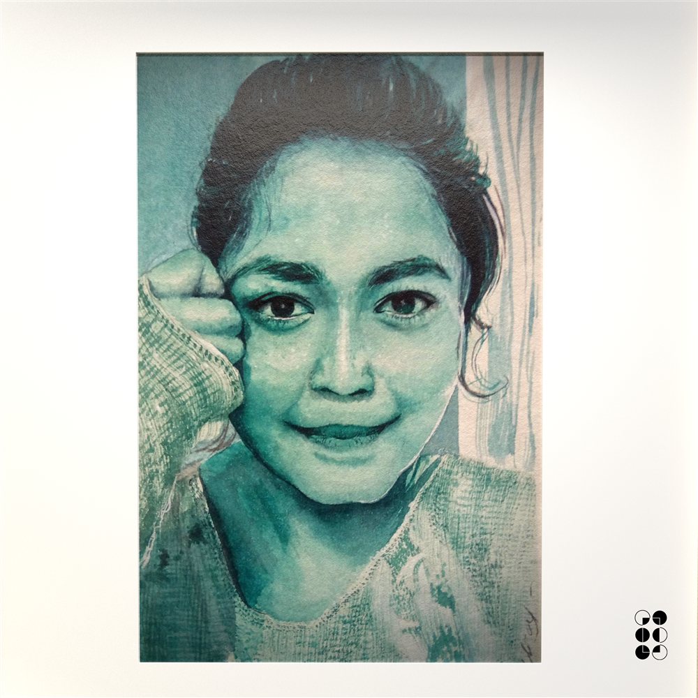
I believe the most powerful commercial visuals borrow from fine art — they make the viewer feel something before they read a word. My work starts from a painting instinct and ends at a shelf, a screen, or a campaign.

Disciplines
Art Direction Brand Strategy Campaign Thinking Fine Art
BFA Applied Arts  ·  Gold Medal
Jus Amazin  ·  2+ yrs sole AD
Open to  ·  In-house · Agency
Marketing Design Art Education Design Systems Brand Identity Packaging Illustration Painting & Art Open to Remote Marketing Design Art Education Design Systems Brand Identity Packaging Illustration Painting & Art Open to Remote
D2C Brand Strategy Retail POS Design Brand Guidelines Social Media Kits Product Photography Direction 3D Render Supervision Packaging Systems Identity Architecture D2C Brand Strategy Retail POS Design Brand Guidelines Social Media Kits Product Photography Direction 3D Render Supervision Packaging Systems Identity Architecture

Case Study — Aug 2023 to Present

Jus
Amazin
Brand System

01 — Challenge
A D2C peanut butter brand with strong product quality but no coherent visual identity. Packaging was inconsistent across SKUs, social presence lacked direction, and retail shelf visibility was weak against established competitors.
02 — Approach
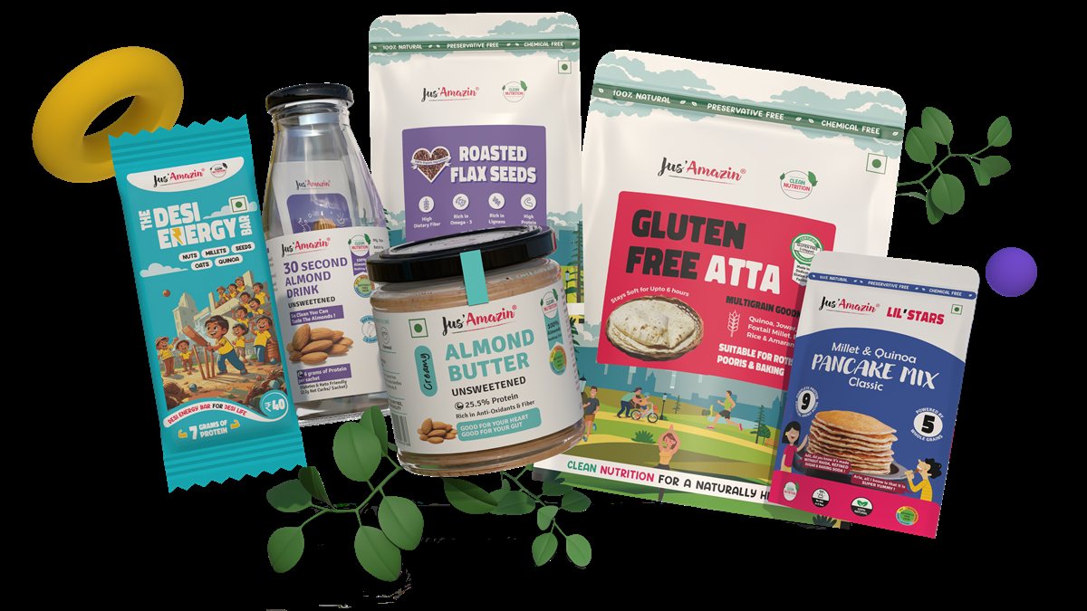
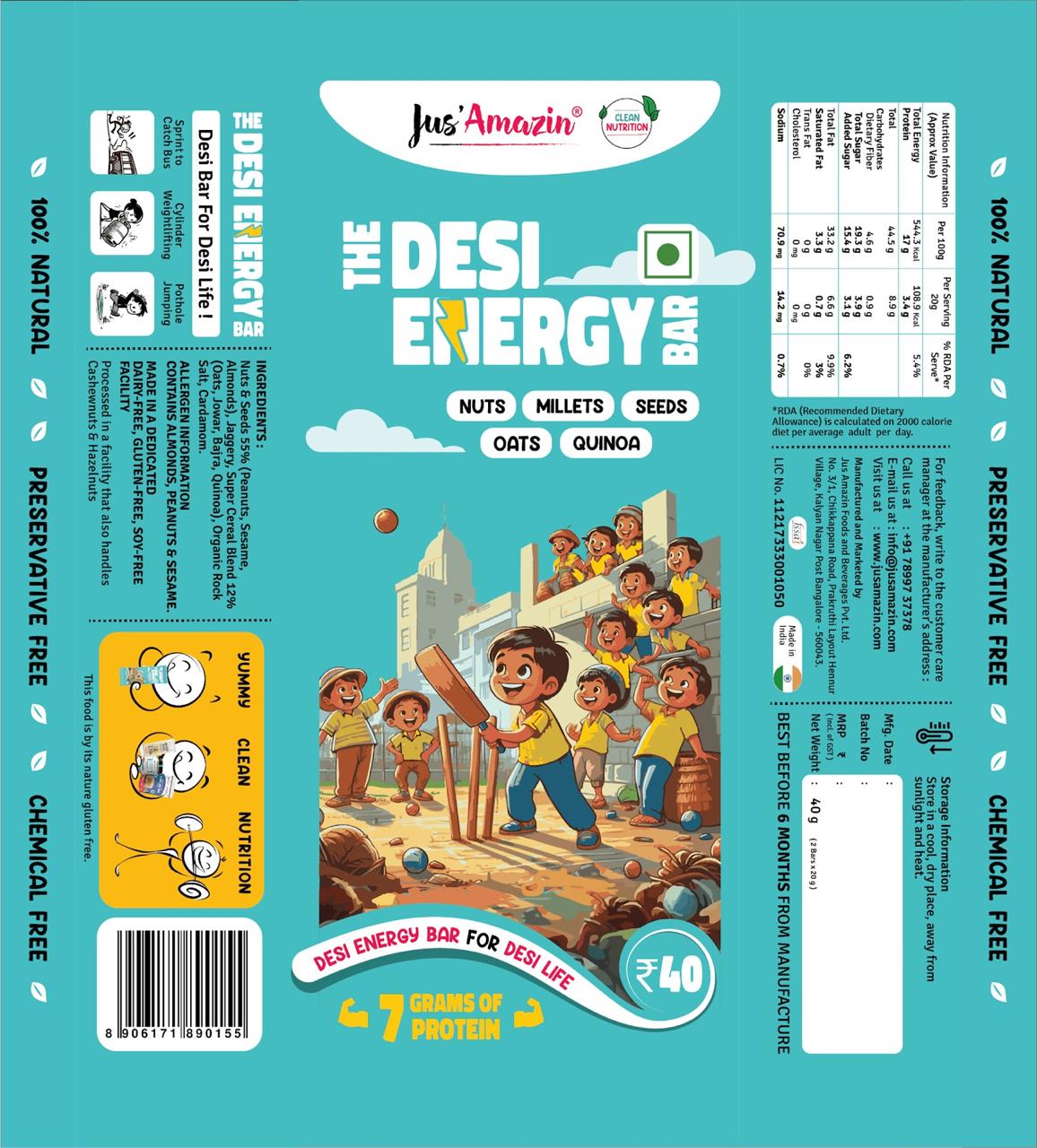
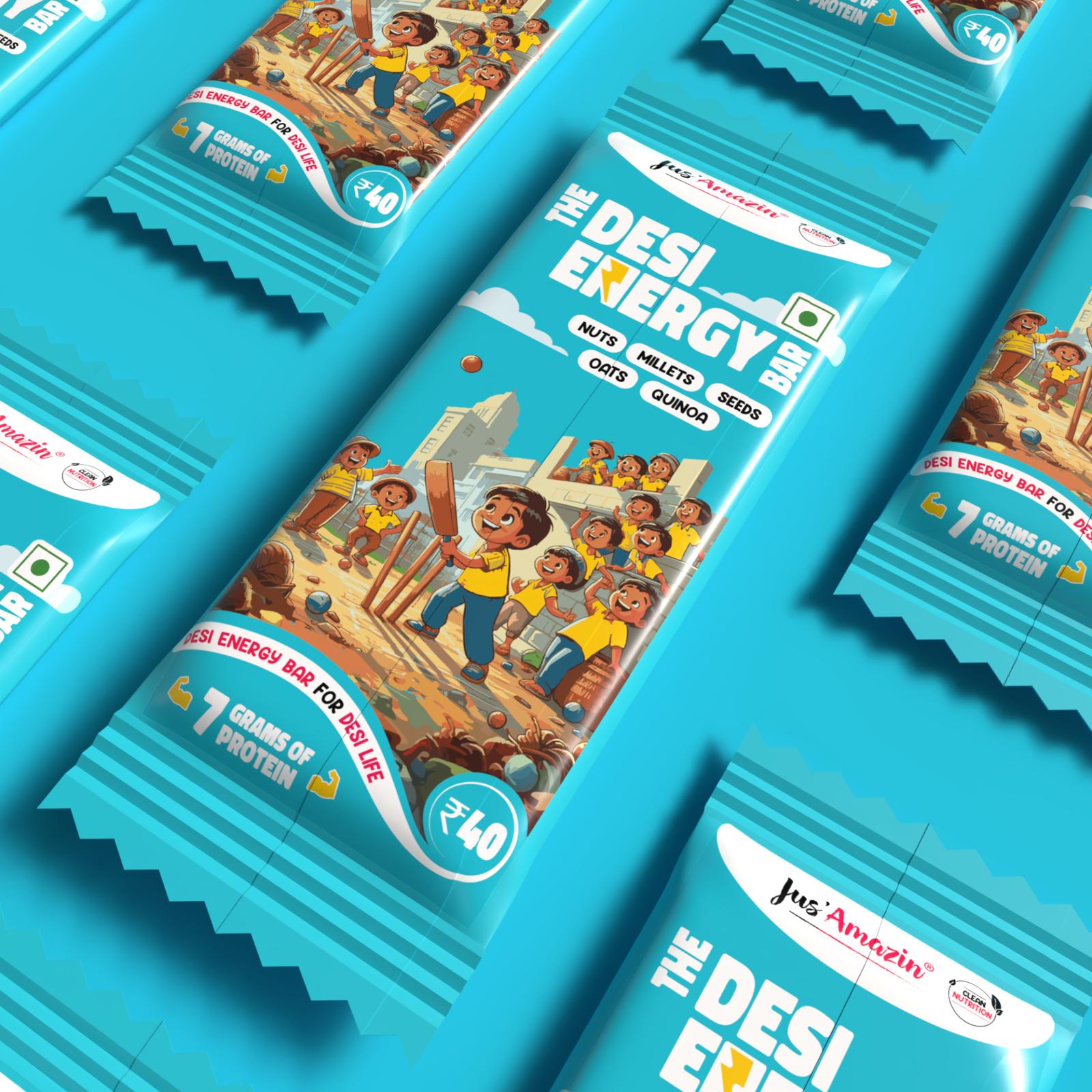
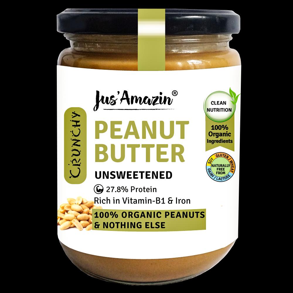
Built a complete brand system from scratch — starting with packaging logic for 15+ SKUs, then extending into social media templates, retail POS materials, and a brand guidelines document the team could use independently.
03 — Outcome
176% revenue growth in the period following the rebrand. Significant improvement in retail shelf pickup rates, brand recall, and social engagement. Every team member could now produce on-brand assets independently.
Hero packaging shot — earth tone substrate signals artisanal production without using the word artisanal Hero Packaging Shot
Earth tone matte substrate · Shot at 15° below horizon
Breaking the conventional overhead FMCG angle creates authority. Earth tones signal craft production without using the word "artisanal."
Social media template — visual system designed to work as a campaign, not just a template Social Media Template
Packaging visual language extended to social
The same earth tone palette and typography system travels from pack to feed. Brand recognition builds through repetition of visual logic, not logos.
3D Pack Render
Warm shadow cast left · Neutral environment, controlled lighting
Subconscious association with late afternoon golden hour — used across premium food photography for trust-signaling warmth.
Motion Graphics
Motion at 1:1 ratio · Sound-off optimised
Brand video designed for quick-commerce product pages — the visual system proves itself in motion, not just on shelf.
Before — Aug 2023 (at joining)
Old Jus Amazin peanut butter jar — pre-rebrand
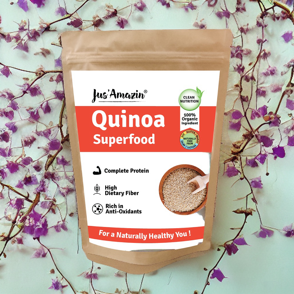
Old Jus Amazin quinoa pouch — pre-rebrand
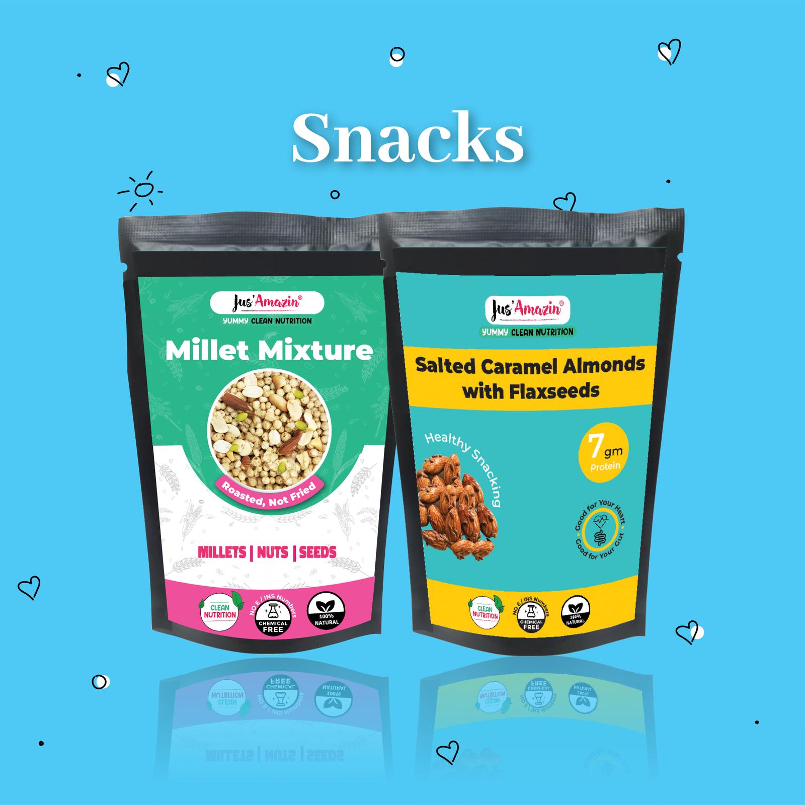
Old Jus Amazin snacks pouch — pre-rebrand
Generic label printing. No system. Each SKU looked like a different brand — clashing colors, different typography, no shelf-ready files, no brand rationale document.
After — 2023 onwards
Unified visual language. 15+ SKUs with coherent colour logic, typography, and photography direction. A brand guidelines document the entire team uses daily.
176%
Revenue Growth Impact
2.5×
Brand Recall Increase
40%
Design Efficiency Gain
15+
SKUs Designed
The Visual Concept

The Idea Underneath the Execution

Urban consumers distrust health food that tries too hard to look healthy — the clinical whites, the leaf icons, the wellness rhetoric. The visual concept was the opposite: make nutrition look like it belongs in a kitchen, not a pharmacy. Earth tones from painter's palettes. Typography that breathes. Photography that references how real food looks in real light. The idea was nutritional confidence without nutritional anxiety.

The Aesthetic Argument
Earth Over Clinical
Every color decision drew from painter's earth tones — raw sienna, burnt ochre, natural umber — because these are colors that have carried human trust for centuries. When a consumer sees them, the nervous system says "natural" before the brain reads a word.
The Type Argument
Precision as Confidence
The typography system uses stillness and weight to communicate what most health brands try to say with words. A well-spaced, confident typeface doesn't need to say "clean label" — it already looks like one. Typography is the brand's posture.
What We Rejected

Three Directions That Didn't Work

01
The Bold Tech Direction
High-contrast black packaging with neon accent typography. Performed well in gym-adjacent categories but created wrong associations for a brand positioning around clean, natural nutrition. Too aggressive for the primary audience — urban family buyers.
02
The Minimal White System
Clinical white backgrounds with typographic-only design. Looked credible but disappeared on shelf against established competitors using the same language. Differentiation requires visual contrast, not visual agreement.
03
The Illustrated Nature Direction
Hand-drawn botanical illustrations. Beautiful but already owned by premium Ayurvedic brands. The concept was derivative — borrowing someone else's visual language signals a brand without its own point of view.
From Packaging to Campaign

How the Visual System Travels

A packaging system that only works on pack is a design system. A packaging system that works in advertising is a campaign. The Jus Amazin visual language was built to travel — here is how the same logic extends across three advertising touchpoints.

01 — Social / Instagram
Earth tone palette + kinetic typography — The same warm substrate colors become social backgrounds. Clean-label claims delivered as bold type statements. The pack becomes the hero visual in every frame.
02 — Q-Commerce / Blinkit
Split-screen product demonstration — The packaging system's visual confidence carries into video. The 30-second almond milk comparison film uses the same earth tones and typography rhythm — brand recognition before brand name.
03 — OOH / Outdoor
Single visual, single truth — The packaging color logic reduced to one bold frame at billboard scale. Earth tone product on warm background. Zero copy except the brand name. The visual concept is strong enough to work without words.

Art Director · Brand Strategist · Fine Artist

I direct the
way things
look and feel.

I'm Shiv — H P Shivaraj. I come from fine art. I have a BFA in Applied Arts and I understand how images make people feel, not just how they look. I've spent 2+ years as the sole creative director for Jus Amazin — a D2C brand that grew 176% — meaning every visual decision I made, I owned completely, and the results were measurable. I paint. I teach people how to see. And I have a deep understanding of how advertising works at the communication level, not just the execution level.

Design is how I think. Art is how I feel. I co-founded Svarnart Academy with my wife — a space where Carnatic music, painting, and design education coexist. Born and raised in Namma Bengaluru, that texture shows up in everything I make.

◆ Art Director ◊ Brand Strategist ♥ Fine Artist † Art Teacher ⊆ Founder
What I Reference
Raja Ravi Varmafor colour weight, narrative density, and the proof that Indian visual language can be simultaneously classical and commercially powerful.
Saul Bassfor structure that carries emotion — the reminder that simplicity is a decision, not an absence.
Herb Lubalinfor type that becomes image — the understanding that typography is never neutral.
Indian vernacular commercial artfor shelf-confidence, colour boldness, and the understanding that visual trust is built differently when the audience knows the culture from the inside.

Two domains.
One person.

Scroll to explore my different practices.

01 / Design

Design Manager & Art Director

Directing visual and print packaging architecture in-house at Jus Amazin. Concurrently running Sivnco Studio, executing identity systems and design challenges for brands that value visual craft.

JUS AMAZIN SIVNCO STUDIO PACKAGING SYSTEMS 176% REVENUE IMPACT
02 / Art

Art Education & Fine Art

Teaching fine art, drawing, and visual thinking at Svarnart Academy. Integrating classical Indian roots with contemporary practice, building on a history of academic excellence at Openhouse.

SVARNART ACADEMY OPENHOUSE ACHIEVEMENTS FINE ART PRACTICE
The Name Behind the Academy

SVARNART

Where classical Indian roots meet contemporary visual craft. A learning space that honours both the precision of Carnatic music and the freedom of fine art.

SVAR
Sanskrit for note, sound, and harmony — the musical root
+n+
ART
Visual art, painting, and creative expression
What We Built
Co-founded with my wife — a shared creative vision built on mutual respect for craft
Carnatic music, classical painting, and design education under one roof in Bengaluru
A platform where traditional Indian arts and contemporary visual practice coexist with intention
Visit Svarnart Academy →

Impact

In their
words.

JM
Jitin Munjal
Co-Founder & CEO, Jus Amazin
jusamazin.com
"
Shiv doesn't just design — he builds systems. The Jus Amazin packaging is one of the most coherent brand rollouts I've seen for a D2C brand at our scale. Every SKU told the same story.
SR
Shilpa Rao
Brand Consultant
"
What sets Shiv apart is his ability to blend art sensibility with commercial clarity. He understands the brief, then exceeds it — every single time.
OH
Openhouse Team
Learning Hub, Bengaluru
openhouse.study
"
Our students love Shiv's classes. He brings a calm, observational approach to teaching that makes even complex concepts feel intuitive and joyful.
ASK SHIV'S AI