Art Direction · Campaign Thinking
CampaignsEvery brief is a question. Every campaign is a point of view. Six comprehensive advertising & packaging campaigns — across motion, festive luxury structural engineering, sub-brand launches, retail POS, and packaging systems — built on consumer insight, not aesthetic preference.
I believe design that moves product isn't different from design that moves people — it's the same instinct applied to different contexts. The campaigns here started with a human truth and worked backwards to the visual form that best carries it.
6
Campaigns
11K+
Orders Generated
8K
Units/Month
5×
Floor Throughput
01 — 30 SAM: 30-Second Revolution02 — Desi Energy Bar: Nostalgia with Rigour Underneath03 — Superfoods Range: De-Clinicalizing Wellness04 — Festive Gifting: Structural Unboxing & Artisanal Gold05 — Lil'Stars Launch: Playful Nutrition & Scripted Motion06 — Spatial Retail: From 5ft FSUs to Dubai World Trade Centre
01
Campaign · Motion · Q-Commerce
30 SAM
Second Almond Milk
CASE_STUDY_04 // CATEGORY: FMCG_MARKETING_SYSTEMS
TL;DR
Brief: Break consumer illusion about what's inside their carton.
Idea: Weaponize transparency — make the 30-second paste replace an 8-hour ritual on screen.
MY ROLECreative DirectionMotion ConceptScript & StoryboardVideo EditingTypography SystemPackaging Redesign
The Brand
Jus'Amazin — 100% Almond Milk Paste (Sachet Format)
The Brief
Break into the dairy-free milk alternative category on quick-commerce platforms where decisions happen in under 3 seconds. Expose the 1–4% almond content hidden inside mass-market carton brands and position Jus'Amazin's pure paste sachet as the radical, transparent alternative.
The Consumer Insight
Most people buying almond milk from a carton don't know what's actually inside. They trust it because the packaging says "almond." The reality is that most mass-market cartons contain 1–4% actual almond — the rest is emulsifiers, thickeners, and stabilizers. That gap between what people believe and what they're actually buying is where the whole campaign lived.
The Concept
Don't hide it, show it. Instead of building prettier packaging, the idea was to make the ingredient comparison unavoidable. Two films, two angles: one that puts our paste against a competitor's carton side by side for 30 seconds — no voiceover, just the visual doing the work. And a second, quieter film that lets typewriter click-clacks and plain text do the talking. The kind of quiet confidence that premium consumers respond to.
Strategy — 6 Pillars
01
[THE_TRANSPARENCY_TRAP]
The Collective Illusion
Most people pick up almond milk because they trust the label. What they don't know — because there's no reason they would — is that the carton in their fridge is mostly water, emulsifiers, and thickeners. Maybe 2% almond, if that. The whole campaign started from asking: what if consumers could actually see that? What if we made the gap between the claim and the contents impossible to ignore?
02
[DISAPPEARING_ACTS]
Creative Disruption
The shift we needed to make was this: homemade almond milk is great, but nobody has time to soak, peel, blend, and strain on a Tuesday morning. The sachet collapses all of that into 30 seconds. The creative job was just to make that trade feel obvious — almost embarrassingly obvious. Show the 8-hour ritual disappearing. Let the convenience prove itself on screen.
03
[THE_7_DAY_BLAST]
High-Velocity Conversion
The 30-second film was built for quick commerce. At that scroll speed, you have maybe 3 seconds before someone keeps moving. We put the comparison right at the top — carton ingredients vs. what's in our sachet — and let the contrast do the selling. No spokesperson. No music. Just the visual argument, straight. The first 3-day run was enough to show it was working.
04
[NOSTALGIC_DISRUPTIONS]
The Silent Attack
The second film was for a different kind of person. Someone who finds the loud D2C energy exhausting and trusts brands that don't shout at them. It's all type — vintage typewriter style, clicking through the ingredient facts one by one. No voiceover, just the sound of keys and the text appearing. The kind of ad that feels more like a document than an advertisement. Which is exactly why it worked for the audience it was targeting.
05
[CHROMATIC_RETAINING]
The Royal Pivot
Once the campaign proved the concept, the package needed to match it. The original sachet design was fine — but "fine" loses on shelf. We went through a few rounds of testing before landing on the Royal Purple. It sounds like an odd call for a health product, but that's exactly what made it work. It stopped people. Purple doesn't exist in that category. Once they tried it and liked it, the color became the recall cue. That's how you build retention — not through messaging, but through recognition.
06
[STRATEGIC_SCALE]
Commercial Retrospective
The transparency argument worked. The numbers came in, and leadership confirmed it — new customers coming in specifically because of the ingredient comparison, orders scaling over the following month, and the rebrand giving the whole category a reason to exist. That's what happens when the creative is honest about the product instead of decorating it.
Where everything started…
— The Iteration Lab · Concept Runway
FILE_ID: 30SAM_FACTORY_WIP
Industrial Prepress & Press Run
Live factory floor footage showing high-speed rotogravure dieline proofing, ink viscosity calibration, and sachet seal inspection under production tension.
FILE_ID: 30SAM_INSIGHT_MAP
Consumer Interaction & Feedback
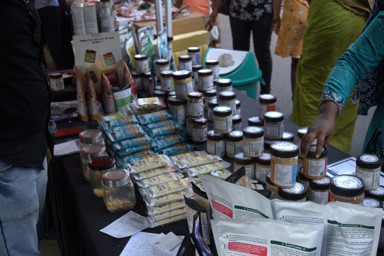
Live consumer tasting sessions at pop-up kiosks — gathering real-time feedback on dissolvability, taste profile, and single-serve sachet usability.
FILE_ID: 30SAM_FINAL_RENDER
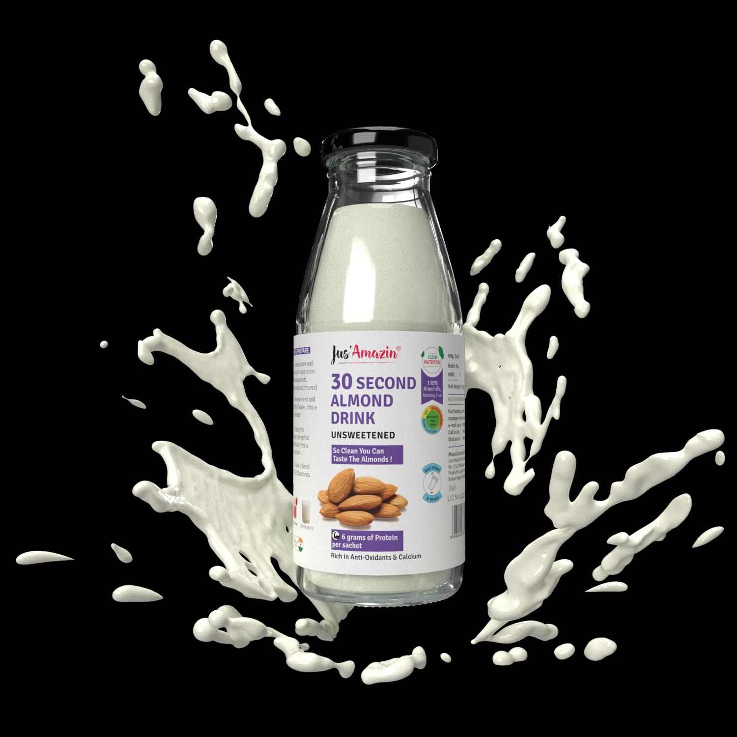
30-Sec Almond Drink 3D Render
High-fidelity 3D studio render and liquid simulation of the final 30-Second Almond Drink bottle, highlighting clean nutrition claims and ingredient transparency.
My View On This
The commercial market hides its shortcuts inside thick, opaque cardboard cartons. To win the consumer's trust, we didn't just build a prettier package; we weaponized transparency. By stripping away retail clutter and wrapping our product in a striking Royal Purple statement, we made user inconvenience disappear. Design at this scale isn't about matching the category — it's about creating an uncompromised visual truth that forces the market to answer for its ingredients.
Execution — Across Touchpoints
01
Q-Commerce PDP
30-Sec Comparison Film
Art Direction Note
Split-screen tension at 1:1 aspect ratio — the left side compresses 8 hours of traditional overnight process into 10 seconds, the right shows the paste dissolving in real time. No voiceover needed. The visual does the persuasion.
Channels
Blinkit PDP · Zepto Product Carousel · Amazon A+ Content
02
Social / Paid
30-Sec Kinetic Typography
Art Direction Note
Built for sound-off vertical scrolling. Kinetic typewriter animation — vintage click-clack audio disruption delivering proof points: "100% Almonds", "No Emulsifiers" — in the first 3 seconds. Type is the visual idea here, not decoration.
Channels
Instagram Stories · Reels · Meta Paid Acquisition
03
Brand / YouTube
Full Campaign Launch Film
Art Direction Note
Long-form brand film combining macro ingredient photography with lifestyle integration. Positions "30-Second Almond Milk" as a clean, sustainable dietary upgrade — not a convenience hack.
Channels
YouTube Pre-Roll · Brand Website · Amazon Storefront
Campaign Funnel Comparison Matrix
| Funnel Vector | 30-Sec Comparison Film | 30-Sec Kinetic Typography | Full Campaign Launch Film |
|---|---|---|---|
| Campaign Asset Type | Visual Breakdown Tactic | Silent Attack Tactic | Long-Form Brand Film |
| Active Run Duration | 7 Days — High-intensity cross-platform run | 7 Days — Targeted minimal niche positioning | Ongoing — Brand & storefront placement |
| Top-Funnel Reach | 15K–20K Impressions | 15K–20K+ Audience Reach | Full-funnel brand building |
| Mid-Funnel Conversions | 6,000+ Active Conversions | 3,000–4,000+ Targeted Reach Outs | Trust layer for retention |
| Bottom-Funnel Orders | 11,000+ Orders (30–45 Day Window) | 2,000–3,000+ Settled Product Orders | Category entry for new audiences |
| Primary Consumer Reaction | Immediate visual shock & brand switching | Sophisticated curiosity & steady onboarding | Trust-building for health-conscious families |
Performance Dashboard
TOP FUNNEL
20K
Max impressions captured during the initial 3-day high-velocity platform burst.
MID FUNNEL
6,000+
Verified user conversions driven by the transparency visualization asset.
BOTTOM FUNNEL
11,000+
Cumulative sachet orders scaled over a 45-day attribution cycle.
RETENTION LOOP
LOYALTY↑
Long-term retention index established via post-visual rehaul brand standard.
Feedback Matrix — Segmented Personas
Leadership
This comparison format completely simplified our category education. It has elevated our overall content standards, significantly boosted our brand image, and funneled entirely new customer segments straight into our 32nd almond milk category.
Jitin Munjal
Co-Founder & CEO, Jus'Amazin
Leadership
The transparency visualization worked beautifully. It gave our consumers a clear, unmistakable reason to look for our house-made sachet over common cartons, and the conversion numbers speak directly to how well that narrative connected.
Shilpa Moglishetty
Co-Founder, Jus'Amazin
What I'd Do Differently
If I were to extend this, I'd develop an OOH version — a single visual of the paste jar next to a clock showing "8 Hours vs. 30 Seconds." The idea is strong enough to work on a billboard at 60kmph. The comparison campaign proved the concept; the next step is scaling the transparency argument beyond digital into physical retail presence.
02
Campaign · Packaging · Retail
Desi Energy Bar
Structured Chaos
CASE_STUDY_02 // CATEGORY: RETAIL_PACKAGING_SYSTEMS
TL;DR
Brief: Make health food feel Indian, not imported.
Idea: Structured Chaos — nostalgia as an asset, colour as a long-range weapon.
MY ROLECreative DirectionField Research (25 stores)Character DesignRetail PackagingColor StrategyCampaign Platform
The Brand
Jus'Amazin — Desi Energy Bar Range
The Brief
Launch a new energy bar into a saturated health snacking category dominated by clinical, Western-aesthetic brands. Stand out on shelf, create an emotional connection with Indian consumers across generations — from children to elderly — and reposition a traditional chikki as a culturally grounded daily ritual rather than a generic health product.
The Consumer Insight
Go to any health snack aisle and everything looks like it belongs in a gym. Clean sans-serif, white space, green accents — it all says the same thing. That aesthetic is borrowed from Western markets, and a lot of Indian consumers don't see themselves in it. This product had the actual cultural story to tell — it's a chikki, which is exactly what every Indian kid grew up eating after school. The insight was: don't pretend to be something imported. Own where you actually come from.
The Concept
Structured Chaos. A visual language that deliberately breaks the grid — maximalist, vibrant, nostalgic — but underpinned by rigorous color theory and compositional logic. The "chaos" signals cultural authenticity. The "structure" signals quality. Neither works without the other. For kids: vibrant, energetic caricatures and fluid custom character animations. For the 30s–40s demographic: hyper-local street memories — raw games of Lagori, chaotic Gully Cricket matchups, and the unmistakable silhouette of a vintage Atlas Bicycle (specifically the classic models). The Lightning Blue/Turquoise background was the final master key — engineered for long-range shelf presence to pull consumers from across the store into our short-range nostalgia story.
Strategy — 4 Pillars
01
[THE_IDENTITY_GAP]
The Plain Commodity Problem
In its early stages, the product was trapped in a generic category template — visualized as a plain health bar lacking a distinct soul or reason to exist. It had no narrative muscle to define what it was or why it existed. The challenge was to transform an uncharacteristic functional food into an emotional, culturally grounded daily ritual for Indian families.
02
[THE_25_STORE_FIELD_STUDY]
Behavioral Mapping
I spent time watching people at retail stores — around 20–25 across the city. Not with a formal survey, just observing who stopped, who picked things up, what age groups noticed what. What came through clearly was that kids and parents respond to completely different things. Kids need something to grab their attention fast. Their parents or grandparents need something that feels familiar. The real opportunity was to make one design do both those jobs at the same time.
03
[VISUAL_FUSION_PLAYBOOK]
Nostalgia as an Asset
For the kids, vibrant illustrations and custom characters — the kind of energy that makes a 7-year-old stop mid-aisle. For the adults buying it, something more layered: Lagori, Gully Cricket, the old Atlas Bicycle. Specifically the old Atlas — not the updated version, the one people of a certain age actually remember. The illustrations needed to trigger a real memory, not a generic one. That specificity is what made it land.
04
[CHROMATIC_BREAKTHROUGH]
The Long-Range Attack
The illustration worked beautifully once someone was right in front of it. The problem was getting them there in the first place. From across the store, the earlier versions were getting lost in the noise. We tried a few directions — warmer tones, earthy colors — and none of them had the pull we needed from distance. The Lightning Blue came through trial and error. It was a risk, because it doesn't belong in the wellness category. That's exactly why it worked. You see it from across the store before you know what it is.
Where everything started…
— The Iteration Lab · Concept Runway
FILE_ID: DEB_FIELD_NOTES
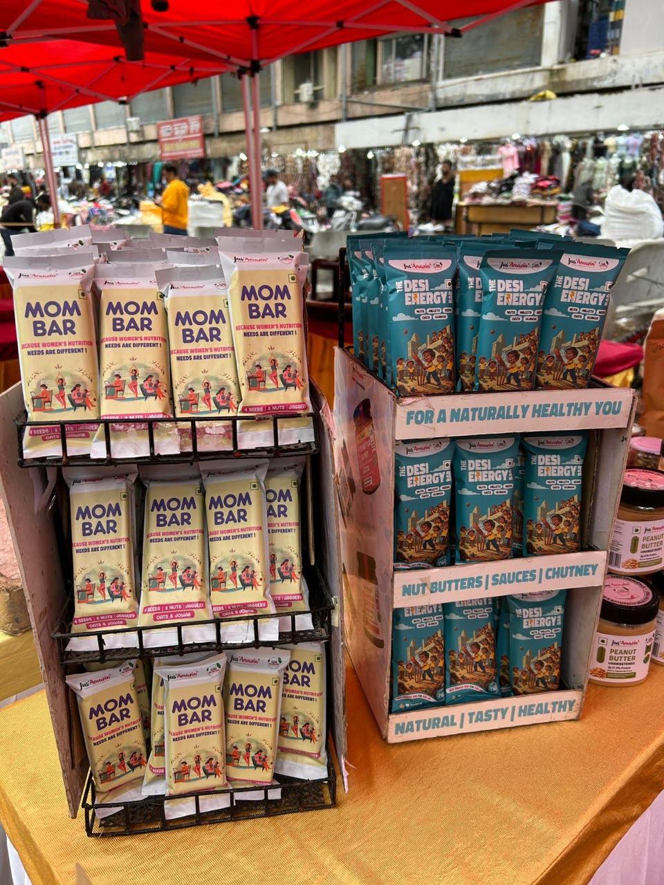
Retail Pop-Up Rack & Display Array
Field testing multi-tier retail display racks and consumer pickup velocity across bustling market pop-ups, proving high touchpoint accessibility.
FILE_ID: DEB_CHARACTER_SKT
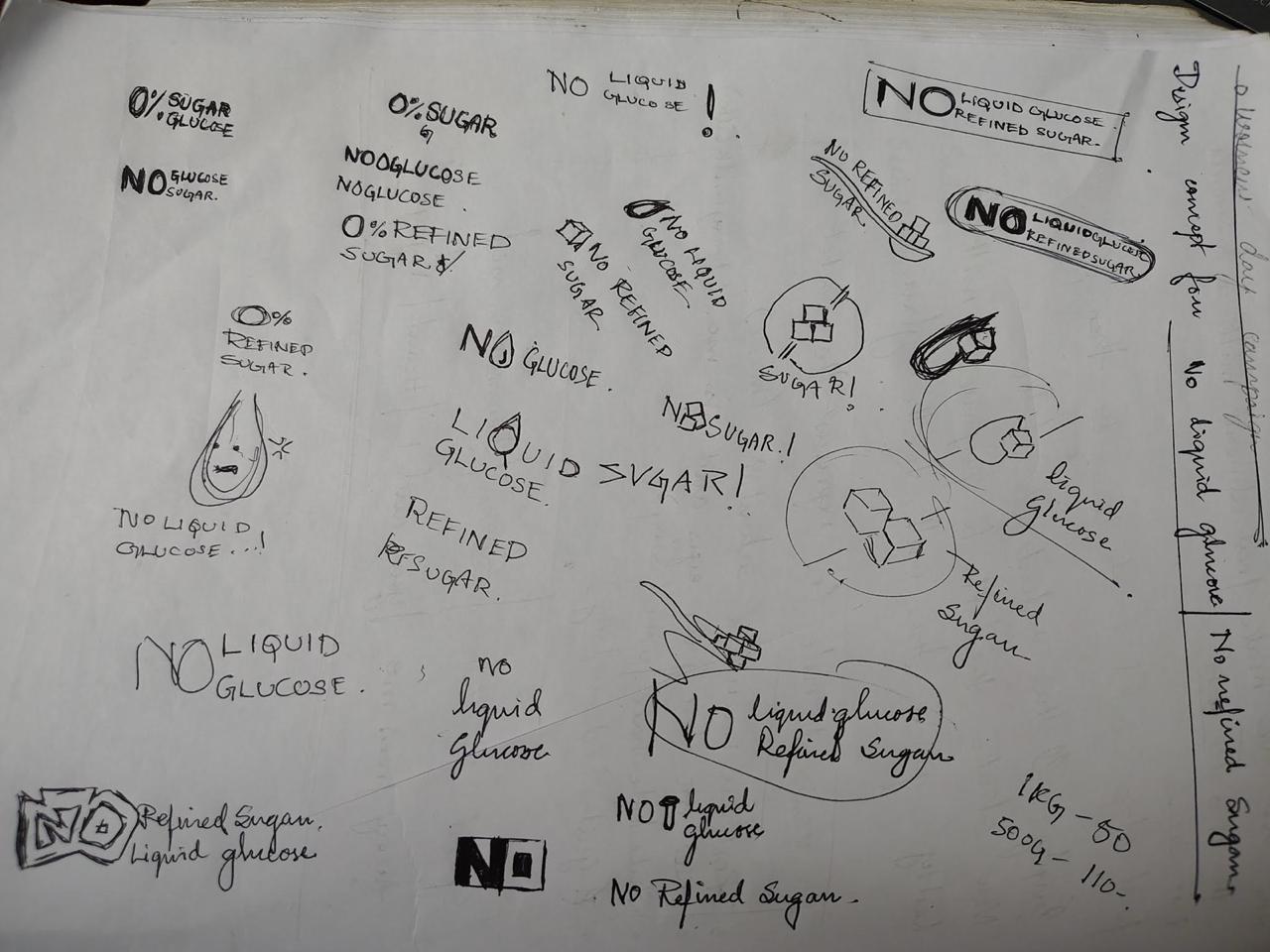
Character Ideation
Raw hand-drawn sketches, vector ink frameworks, and character animation wireframes of local street games — highlighting the structural lines of the vintage Atlas bicycle and the stacked wooden blocks of Lagori.
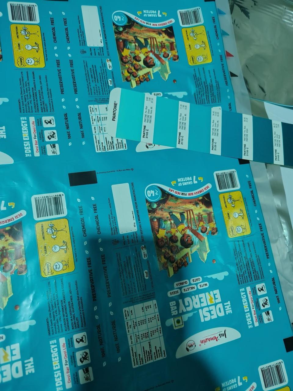
FILE_ID: DEB_COLOR_GRID
Chromatic Testing Grid
A side-by-side display of rejected background variations and safe color templates alongside the winning Lightning Blue/Turquoise composition, proving how the definitive background maximized retail visibility.
My View On This
The core of this project was to capture a specific sensory memory: the post-play "evening snack" where Chikki was our primary source of energy. While the design evolved to combine traditional Indian chikki with a healthy fusion of millets, oats, nuts, and seeds to meet rigorous brand requirements, the "soul" of the product remained unchanged. To me, a successful product isn't just about pixel perfection; it's about the Idea and the Intent. I chose to lean into the "imperfections" and the meaningful chaos of real life, creating a visual language that feels human, nostalgic, and authentic.
Execution — Across Touchpoints
01
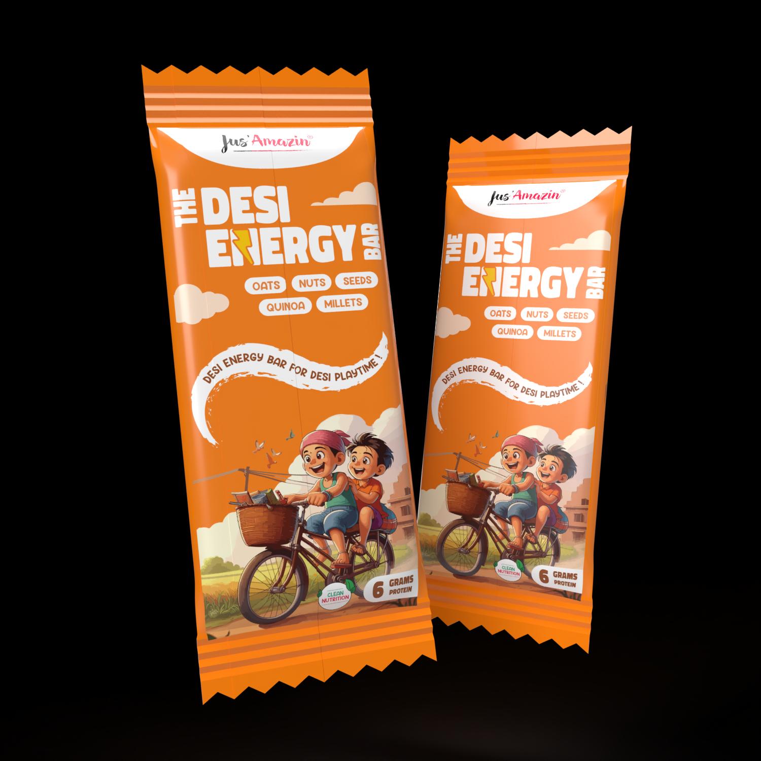
Retail Packaging
Primary Pack Design
Art Direction Note
Electric blue base chosen deliberately against the amber/earth-tone health category. The nostalgic cartoon illustration anchors the "Desi" claim without using the word. Shelf presence over brand consistency — the rule was broken intentionally.
Channels
Retail shelf · Modern trade · Quick commerce
02
Ideation Process
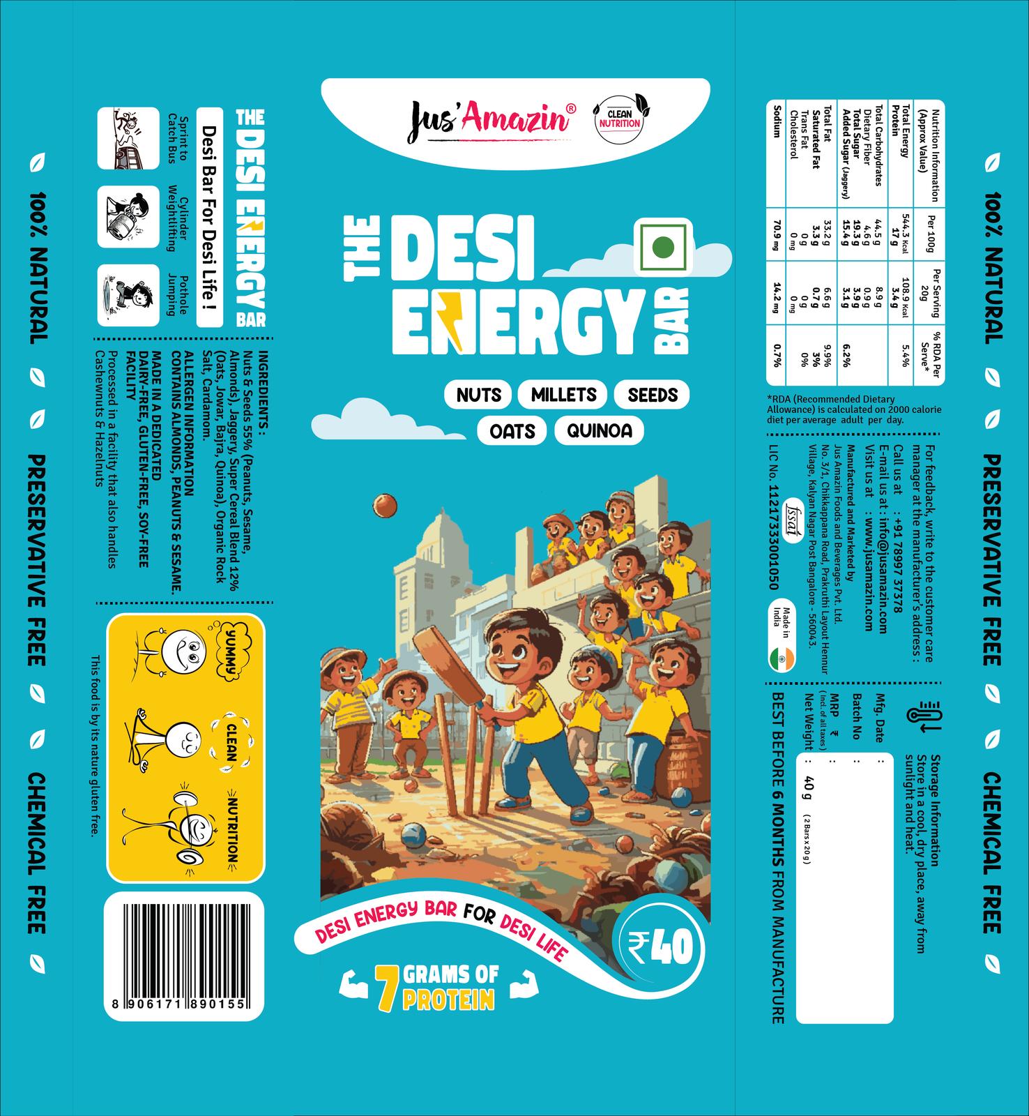
Design Runway — Sketch to Final
Art Direction Note
Seven stages from initial sketch to print-ready file. The concept direction changed twice — early versions were too clean, too "health brand." The breakthrough came when we leaned into the imperfection of hand-drawn illustration as a feature, not a limitation.
Channels
Internal brand review · Production handoff
03
Retail Environment
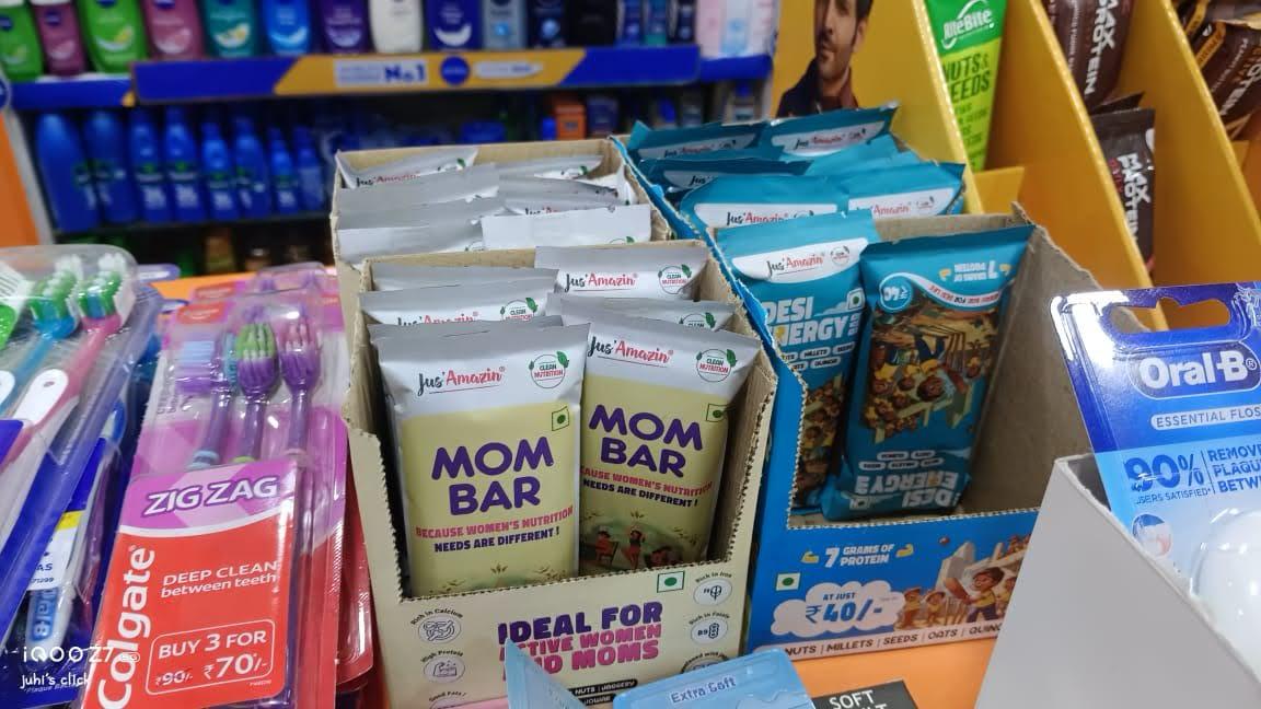
Shelf Placement & Pack Array
Art Direction Note
The array test proved the hypothesis: at retail exposure distance, the electric blue cuts through the competitive set in under 2 seconds. Adjacent products — muted amber, white, green — recede. The chaos creates a visual anchor.
Channels
Physical retail · Modern trade · Checkout POS counter
Performance Dashboard
SALES GROWTH
70%
Increase in snacking range sales following the visual overhaul and nostalgic rebrand.
REVENUE SHARE
34%
Overall contribution of this product to the brand's total revenue in FY 2024–25.
MONTHLY VOLUME
8,000
Units per month. Scaled from 250 units in the first month to current high-velocity production.
BRAND RECOGNITION
58%
Increase in retail brand recognition achieved in Q3 & Q4 of FY 2024–25.
Feedback Matrix — Segmented Personas
Leadership
I've loved the design as it was our dream to have this product in our portfolio as a charmer and this design has held true for all the ideology we wanted for the product.
Jitin Munjal
Co-Founder & CEO, Jus'Amazin
Leadership
Well it is a series of nostalgia that we looked for out of which this design styling worked the best for us as it was the most relevant and connecting to all of us.
Shilpa Moglishetty
Co-Founder, Jus'Amazin
Internal Team
I wasn't sure about the color blue with nostalgia, but surprisingly it works as blue grasps attention and the nostalgia keeps the attention span long enough for them to make the purchase.
Roshan Kulranjan
Business Operations Head
Internal Team
It's so fun and out of the blue. I don't find it typical, but it works great as it sells in the market.
Manoj
Production Head
Internal Team
He has a good understanding of emotions so that grasp of gully cricket was expected, but the fusion of electric blue is what works as a punch.
Juhi Singh
Colleague & Visual Designer
Consumer
It's hard to see kids not choosing healthy stuff due to their plain packaging, and when kids are attracted to healthy stuff like this, it's good.
Arun
Customer / Parent
Consumer
It's a weird story — I wanted to eat something as I was feeling dizzy due to low sugar at a mall. This captured my eyes even on the brink of collapse, but then the cartoons made me smile. It's a fun packaging that really grabs attention.
Dwani Trivedi
Customer
Consumer
Crazy colors and abstract visual appearance, so it's an easy eye-grabber for sure.
Samuel
Customer
Consumer
Well, it's too overloaded, but that's what is out of the box from the market.
Gagan
Customer
What I'd Do Differently
The design solved shelf presence brilliantly. What I'd extend: a 15-second social video where the cartoon character "comes alive" — reinforcing the nostalgia claim in motion. The packaging created the idea; the next campaign is animating it. The chromatic breakthrough — the Lightning Blue — is strong enough to become the brand's permanent visual signature across the entire snacking category.
03
Packaging · Typography · Compliance
Superfoods Range
Precision as Design
CASE_STUDY_03 // CATEGORY: PACKAGING_SYSTEMS
TL;DR
Brief: Turn compliance copy into a trust signal.
Idea: Typography as the brand's argument for transparency — and a universal pouch system as a financial masterstroke.
MY ROLECreative DirectionPackaging System DesignTypography OverhaulFactory Floor UXProduction Print SpecsBrand Guidelines Authoring
The Brand
Jus'Amazin — Superfood Pouch Range (500g / 1kg Flexible Pouch)
The Brief
Redesign the back-of-pack information system and front-of-pack visual identity for the superfood pouch line — achieve premium visual cleanliness while increasing information density, passing regulatory compliance, and creating a modular system scalable across an entire product category lineup.
The Consumer Insight
The existing superfoods range suffered from a severe identity crisis — looking more like cold, clinical prescription medicine than a premium consumer product for individuals seeking a naturally healthy life. In the clean-label category, the back of pack is not a regulatory obligation — it's the second sales pitch. Consumers who flip the pack have already made a provisional decision to trust. What they see next either confirms that trust or collapses it.
The Concept
Typography as brand argument. Every typographic decision — casing, spacing, punctuation, hierarchy — is an implicit claim about the brand's relationship with transparency. "Flax seed" in lowercase says: we are precise, not performative. Removing stray punctuation says: we have nothing to hide. And midway through design finalization, a corporate bottleneck forced a creative breakthrough — a single, universal master pouch format dynamically iterable across multiple diverse products via custom label overlays. The financial constraint became a modular branding masterclass.
Strategy — 4 Pillars
01
[THE_MEDICINAL_TRAP]
De-Clinicalizing Wellness
The original packaging looked like something you'd find behind a pharmacy counter. White, clinical, earnest in the wrong way. It communicated health but not lifestyle, and for a product that sits in premium retail, that gap matters. First thing to fix: make it look like something a person would actually want to have in their kitchen. The medicine shelf aesthetic had to go completely.
02
[THE_PUBLIC_PARK_PARADIGM]
Urban Escapism
Urban consumers who buy superfoods are often chasing something — a bit of calm, a connection to something natural that daily city life doesn't give them. The design direction leaned into that. Natural backdrops, green open spaces — the kind of imagery that makes a person in a metro apartment feel momentarily like they're somewhere else. The product is still very much real food, but the packaging gives it a bit of breathing room.
03
[THE_UNIVERSAL_HACK]
Creative Finance
Halfway through, the budget got tight. The original plan needed individual pouch prints for each SKU — that wasn't going to work anymore. Instead of scaling down the vision, I redesigned the entire approach: one master pouch format, with custom label overlays for each product. Saved money, actually made the shelf look more cohesive, and gave us the flexibility to add new products quickly. The constraint ended up being the better design decision.
04
[OPERATIONAL_ACCELERATION]
Floor-Aware Design
I spent some time on the factory floor watching how the team was applying stickers. The process was slow and inconsistent — people were eyeballing placement, and it was costing hours. The fix was simple: build alignment guidelines directly into the label and packaging print. Not glamorous work, but watching the team go from 100 pouches an hour to 400+ was one of the more satisfying outcomes of this whole project. Good design has to work for the people making the product, not just the people buying it.
Where everything started…
— The Iteration Lab · Concept Runway
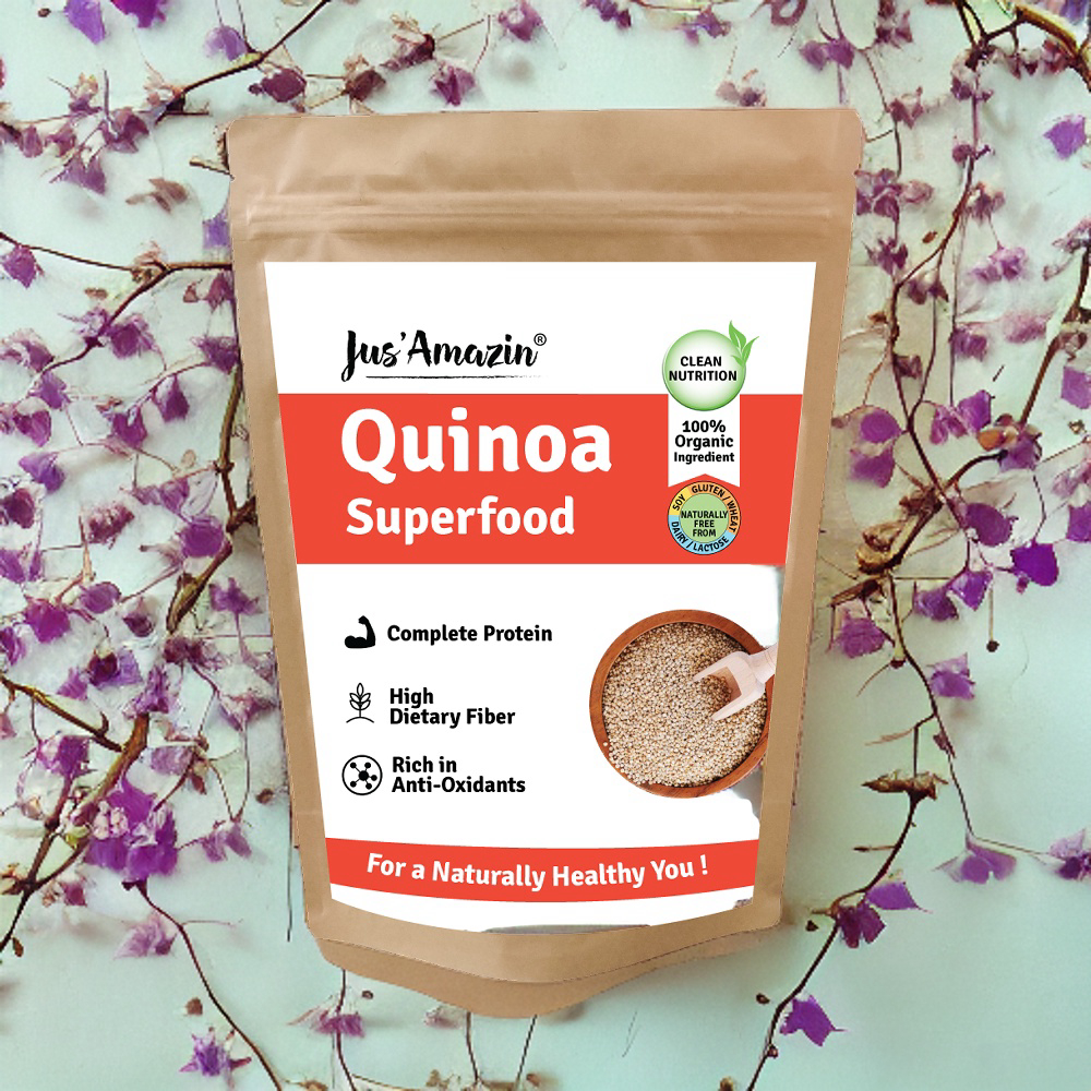
FILE_ID: SF_CLINICAL_BASELINE
The Clinical Baseline
High-resolution comparisons of the original medical-style labels versus early scenic sketch variants — showing the stark contrast between the pharmaceutical aesthetic and the consumer-first redesign.
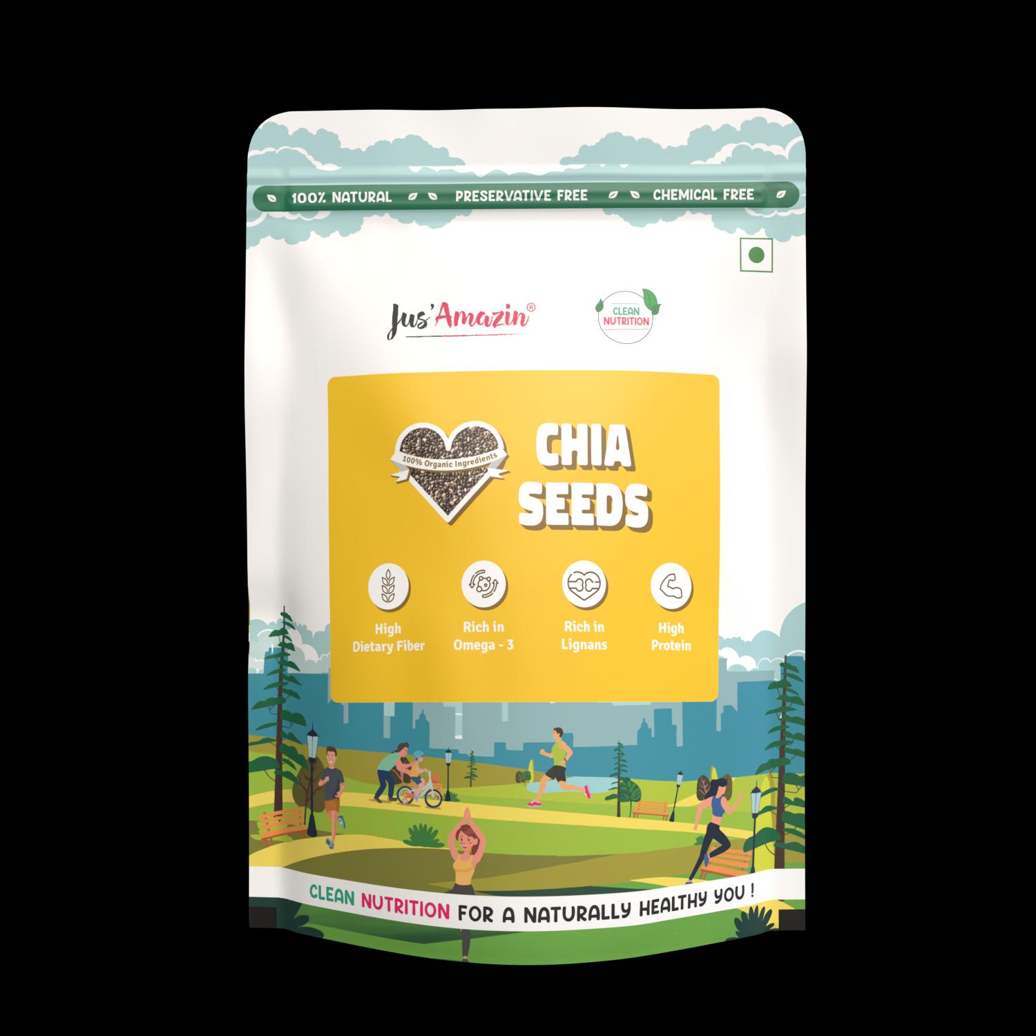
FILE_ID: SF_STICKER_BLUEPRINT
Universal Master Pouch System
Stand-up pouch architecture demonstrating the universal illustrated scenic base with variant-specific sticker overlays, engineered for multi-SKU scalability and 4× factory throughput.
FILE_ID: SF_TYPOGRAPHY_SYSTEM
The Typography Overhaul
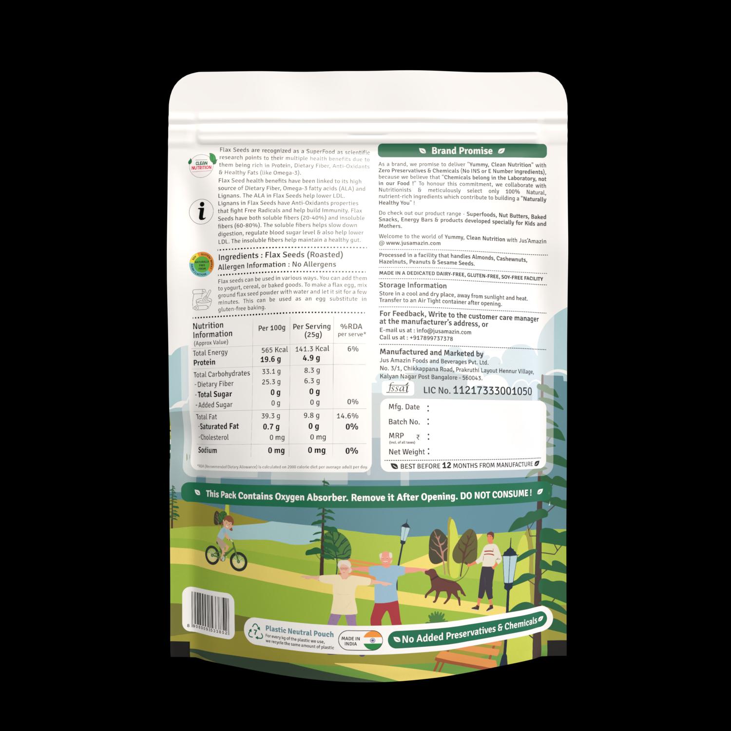
Close-up crops mapping critical back-of-pack corrections — the transition to lowercase formatting ("Flax seed", "dietary fiber", "omega-3") and the application of solid black body font for flawless legal legibility.
My View On This
An elegant design system means nothing if it breaks down on the factory floor or drains the company's fundraising capital. When budget limits and operational friction hit the Superfoods range, it didn't ruin the design — it forced it to become smarter. Shifting to a universal pouch system wasn't just a financial compromise; it was a masterclass in modular branding. Designing strict, visual sticker guidelines wasn't glamorous, but watching real humans on the production line quadruple their daily output proved that commercial design is as much about human empathy and workflow optimization as it is about front-of-pack aesthetics.
Execution — Across Touchpoints
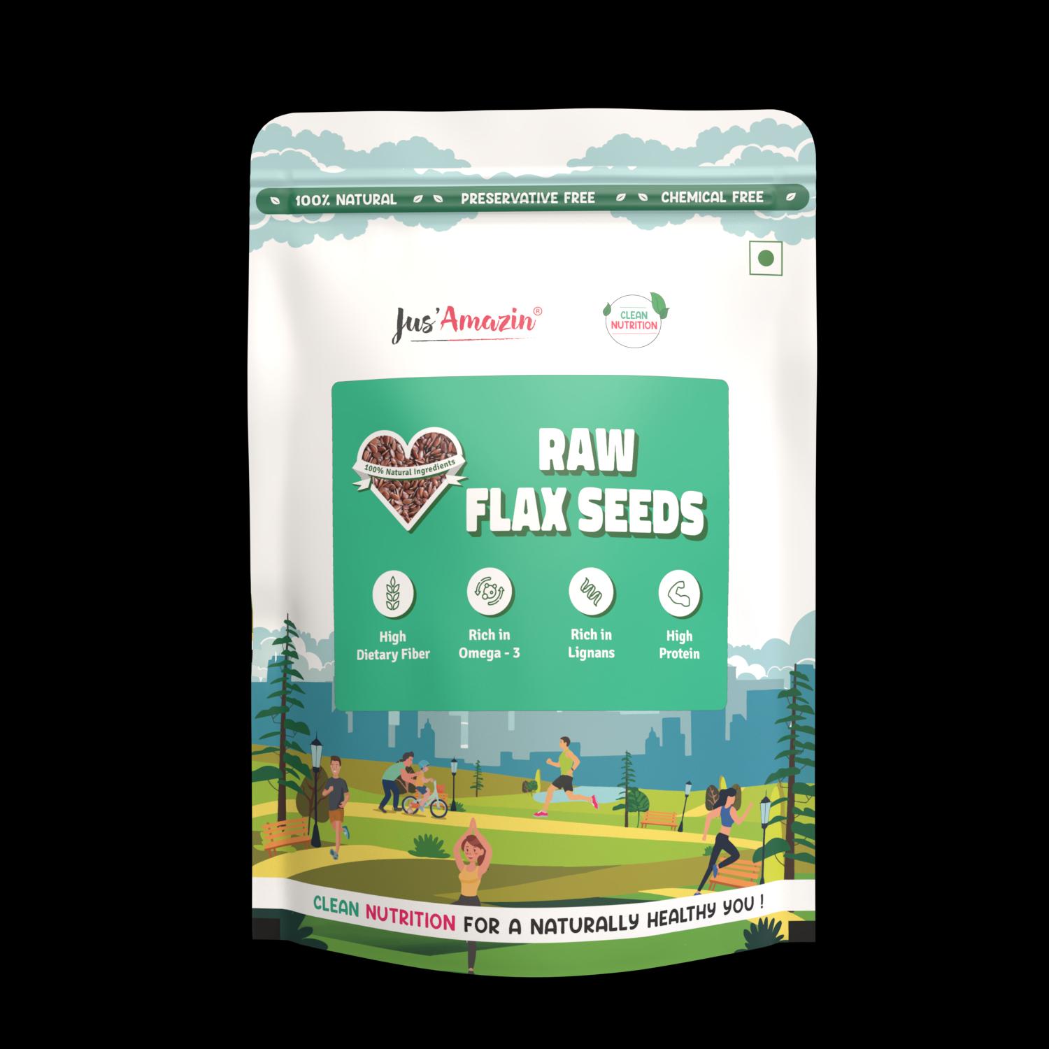
01
Back of Pack
Typography System Overhaul
Art Direction Note
Strict lowercase nomenclature for all ingredient variables — "Flax seed", "dietary fiber", "omega-3". Unified "Superfood" as a single word, eliminating the confusion of "Super Food" spacing. Solid black body font for critical nutritional values (Protein 25.9g, Dietary Fiber 24.1g). The change is invisible to the casual reader and decisive for the engaged one.
Channels
Flexible pouch 500g · 1kg format
02
Shelf System
Universal Pouch Architecture
Art Direction Note
A single master pouch format dynamically iterable across the full product lineup via custom label overlays. Color-coded SKU differentiation with a consistent structural grid. The shelf reads as a system, not a collection. A financial constraint engineered into a modular branding advantage.
Channels
Modern trade shelf · Online product listing photography
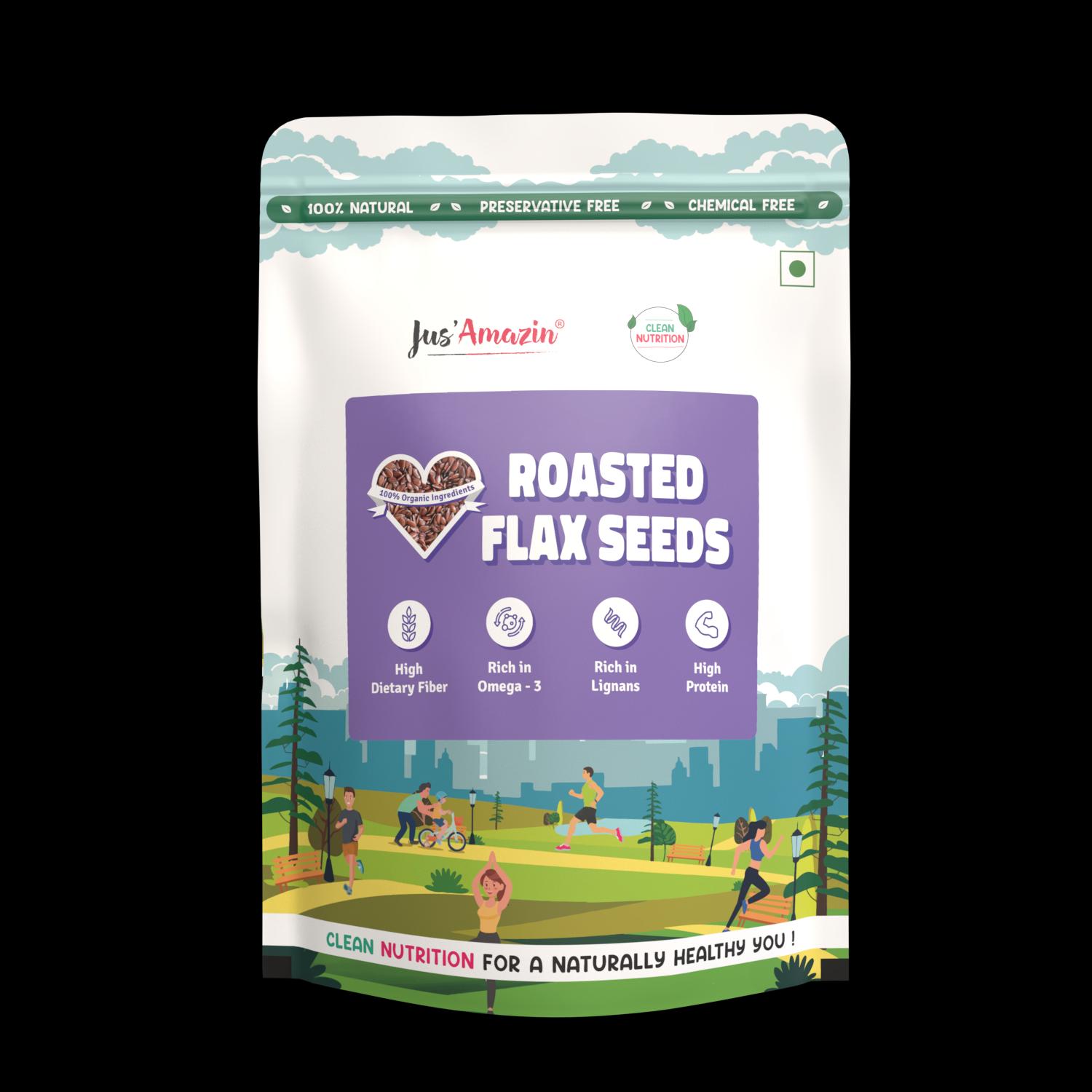
03
Factory Floor System
Alignment Guideline Integration
Art Direction Note
High-visibility alignment guidelines built directly onto the packaging and stickers for human workflow optimization. Removed the manual bottleneck that limited output to 100 pouches/hour.
Channels
Print production · FSSAI compliance · Factory floor deployment
Performance Dashboard
FLOOR VELOCITY
5×
Increase in factory floor packaging and labeling throughput efficiency.
PRINT SCALE
200K
Maximum units scaled in full-fledged commercial printed production runs.
UNITS / HOUR
400–500
Pouches per hour achieved post alignment guideline integration. Up from 100/hr.
Feedback Matrix — Segmented Personas
Leadership
The back-of-pack overhaul cleaned up our technical parameters perfectly. Moving to solid black body text and standardizing our layout casing immediately elevated our regulatory presentation.
Jitin Munjal
Co-Founder & CEO, Jus'Amazin
Internal Team
Before the alignment guidelines were built onto the labels, our team was losing endless hours trying to center stickers manually on the pouches. The new system instantly boosted our hourly output from 100 to over 400 units.
Manoj
Production Head
Consumer
I used to walk right past these packs because they looked like old health supplements from a chemist's shop. The new scenic layouts look incredibly premium and make it clear that this is real, clean food for a healthy lifestyle.
Gagan
Customer
What I'd Do Differently
This project taught me that the most powerful design decisions are often invisible — the ones that make something feel right without the viewer knowing why. The universal pouch system wasn't just a financial workaround; it was a strategic advantage that competitors couldn't easily replicate. I'd take this further by applying the same typographic precision to front-of-pack, making the typographic confidence visible and deliberate on the retail shelf itself.
04
Packaging Architecture · Luxury Gifting · Structural 3D
Festive Gifting
Luxury Festive & Corporate Gifting Suite
CASE_STUDY_05 // CATEGORY: STRUCTURAL_PACKAGING_SYSTEMS
TL;DR
Brief: Elevate clean nutrition into luxury festive and corporate giftware.
Idea: Engineered rigid drawer boxes, gold-foiled mandalas, and dual aesthetics (Ethnic vs. Contemporary) commanding premium corporate price points.
MY ROLECreative DirectionStructural Box EngineeringLaser Foil Dieline SpecsSurface Illustration & Mandalas3D Photorealistic Pre-vizVendor Print Production
The Brand
Jus'Amazin — Festive & Corporate Luxury Gifting Lineup
The Brief
Develop a comprehensive corporate and festive gift packaging suite ranging from 2-jar compact slipcases to 4-jar sliding drawer rigid trays. The packaging needed to compete against traditional mithai boxes while preserving modern clean nutrition integrity.
The Consumer Insight
Festive gifting in corporate India is traditionally dominated by high-sugar sweets with opulent packaging. Health hampers often failed commercially because their packaging felt like brown-box logistics rather than an artisanal gift of respect. To command corporate budgets, the packaging had to deliver an unboxing ritual that rivals luxury confectionery before the consumer even reads an ingredient.
The Concept
The Dual Architectural System. Rather than one generic festive design, we engineered two distinct visual languages: Royal Crimson with gold-foiled mandalas for traditional Diwali/wedding heritage, and Deep Regal Amethyst/Contemporary Geometric gold foils for modern corporate executive gifting. Supported by rigid pull-out drawer boxes, laser-scored windowed pouch hampers, and funky saffron celebration boxes.
Strategy — 4 Pillars
01
[STRUCTURAL_ERGONOMICS]
The Unboxing Choreography
Engineered sliding drawer trays with friction-fit tolerances and satin pull-ribbons. Designed interior die-cut cavities that hold heavy 125g glass jars firmly in place during courier transit without requiring unsightly bubble wrap.
02
[CHROMATIC_SEGMENTATION]
Dual Aesthetic Architecture
Built two distinct design tracks: Royal Crimson with sacred mandala geometry for traditional festive occasions, and Deep Amethyst Purple with minimalist Art Deco lines for corporate C-suite hampers.
03
[METALLIC_PRECISION]
Sub-Millimeter Foil Craft
Hot-stamped metallic gold foils applied over soft-touch matte laminated rigid boards. Tolerances calibrated to 0.25pt vector strokes to prevent foil fill-in during mass automated print production runs.
04
[MODULAR_RETAIL]
Universal Hamper Scalability
Standardized outer rigid footprints while engineering interchangeable inner card trays to host varying configurations — 2-jar sampler packs, 4-jar gourmet suites, or mixed pouch-and-jar gift assortments.
Where everything started…
— The Iteration Lab · Concept Runway
FILE_ID: GIFT_CONTEMPORARY_TRAY
Sliding Rigid Drawer Architecture
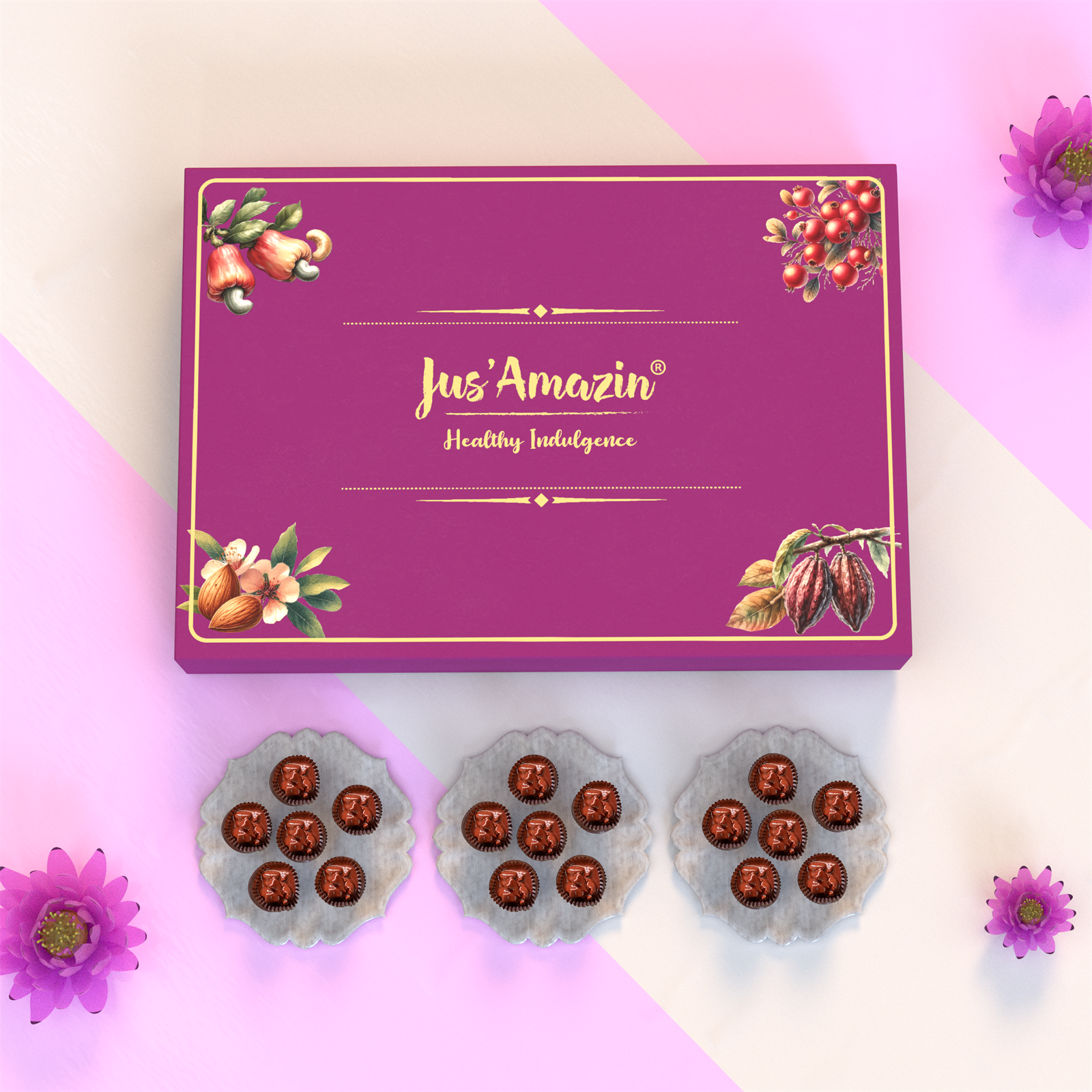
3D structural study of the premium sliding sleeve tray box with gold foil stamped geometric line work and high-density interior insert compartments.
FILE_ID: GIFT_ETHNIC_MANDALA
Laser Foil Stamped Heritage Mandala
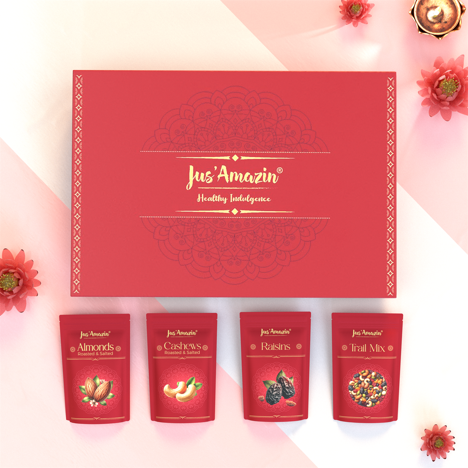
Precision vector hot-stamping dielines for the festive scarlet red tray, balancing intricate Indian heritage art with modern luxury restraint.
FILE_ID: GIFT_WINDOW_BOX
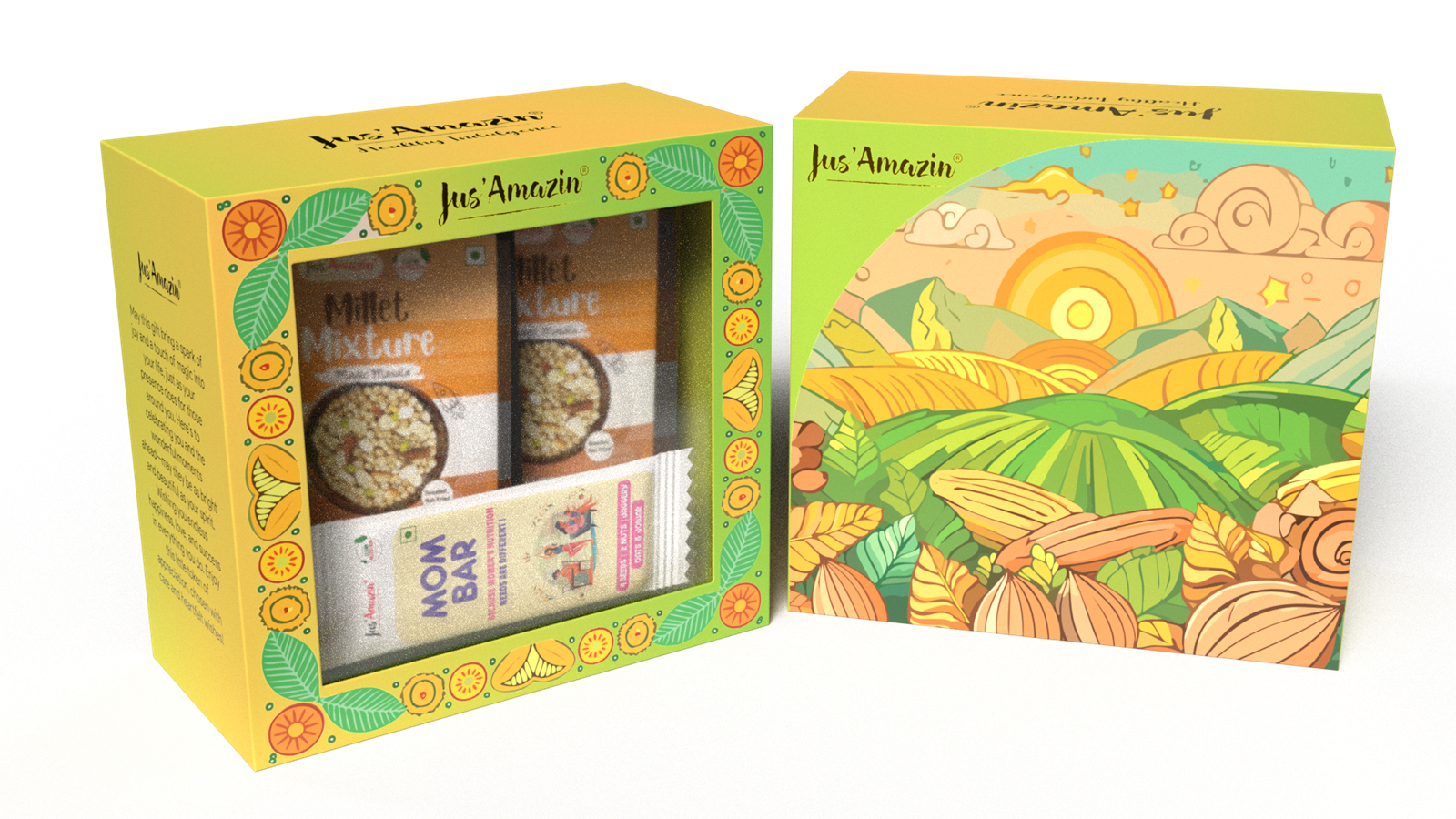
Corrugated Windowed Hamper System
Rigid eco-friendly windowed presentation sleeve engineered to securely anchor multi-format jars and pouch assortments.
My View On This
Luxury in structural packaging is not about adding more decorations — it is about the physics of anticipation. The tension of a sliding tray, the crispness of a foil-embossed line under warm Diwali light, the tactile weight of rigid board. When a corporate recipient opens this box, they must feel honored before they taste a single spoon of nut butter. That transformation turns a pantry staple into a memorable gifting heirloom.
Execution — Across Touchpoints
01
Corporate Executive Suite
Contemporary Sliding Tray Box
Art Direction Note
Deep purple matte board paired with geometric precision gold foil. Slide-out tray mechanism with custom internal die-cut locking cavities for four clean nut butter jars.
Channels
B2B Gifting Catalogs · Corporate Gifting Portals · Executive Direct Outreach
02
Festive & Cultural Suite
Royal Ethnic Mandala Tray
Art Direction Note
Deep crimson festive tray engineered with complex vector sacred mandala artwork, hot-stamped in rich gold foil on rigid board.
Channels
Modern Trade Gifting Aisles · D2C Festive Storefront · Corporate Bulk Orders
03
Full Gifting Portfolio
Complete 5-Format Gifting Suite
Art Direction Note
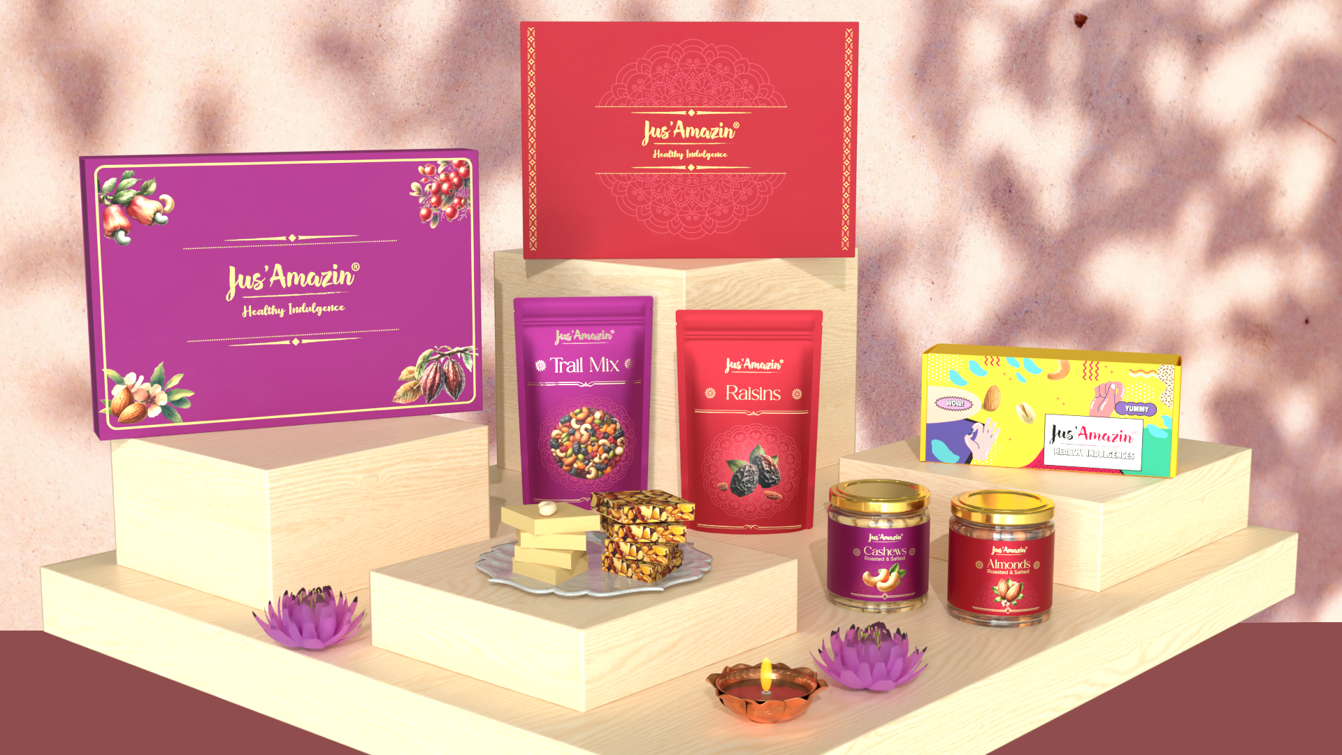
Complete studio view showing sliding rigid trays, compact 2-jar slipcases, vibrant funky celebration hampers, and windowed craft pouch boxes.
Channels
Brand Storefront · Amazon Luxury Pantry · Gourmet Retailers
Performance Dashboard
CLIENT RETENTION
100%
Corporate client reorder rate achieved across festive gifting seasons.
STRUCTURAL SKUS
5 Formats
Bespoke structural packaging formats designed and engineered to mass production.
TRANSIT SECURITY
0 Transit Loss
Zero recorded glass jar breakages due to precision friction-lock internal trays.
Feedback Matrix — Segmented Personas
Leadership
The festive gifting collection opened corporate B2B gifting accounts that previously never considered health food as a premium gift.
Jitin Munjal
Co-Founder & CEO, Jus'Amazin
Internal Team
Shivaraj's dielines and foil stamp registration tolerances were millimeter-accurate, making zero-waste mass production seamless.
Production Vendor
Rigid Box Manufacturer
Consumer
The purple sliding box looked stunning on our leadership desks. The unboxing felt every bit like luxury imported confection.
Executive Client
Enterprise Gifting Lead
What I'd Do Differently
The success of the sliding tray proved that people buy the container first during the festive season. If I were doing it again, I would integrate a magnetic snap enclosure on the outer sleeve for an even richer acoustic click upon closure.
05
Sub-Brand Architecture · Kids Nutrition · AI Motion Direction
Lil'Stars Launch
Lil'Stars Clean Kids Nutrition
CASE_STUDY_06 // CATEGORY: SUB_BRAND_&_GENERATIVE_MOTION
TL;DR
Brief: Create a clean-label kids sub-brand that wins kids' imagination without alienating clean-conscious parents.
Idea: Dual-target packaging design with illustrated animal characters, paired with prompt-engineered Veo motion animation.
MY ROLEBrand Identity & Sub-Brand ArchitectureCharacter & Mascot IllustrationPackaging Suite (Pancakes & Spreads)Veo AI Prompt EngineeringMotion Scene ScriptingStoryboarding
The Brand
Jus'Amazin — Lil'Stars Sub-Brand Lineup (Millet Pancakes & Clean Nut Butters)
The Brief
Launch Lil'Stars, a sub-brand dedicated to 100% clean, additive-free kids nutrition. Create packaging for 3 Millet Pancake Mixes and 4 Kids Nut Butters, accompanied by animated video creative for parent-targeted social channels.
The Consumer Insight
Parents want zero refined sugar, zero preservatives, and clean whole grains; children want fun, flavor, and characters they can connect with. Most kids food brands either look like childish junk food (which parents reject) or sterile organic health food (which kids refuse to eat). The visual strategy needed to communicate joy to the child and clinical nutrition to the parent at the same glance.
The Concept
Dual-Vector Packaging + Veo Generative Motion. For packaging: vibrant character-led illustrations (playful squirrels, bears, and fruit dynamos) with bold, clean typography highlighting "100% Millets" and "No Maida". For marketing: authored detailed scene-by-scene cinematic prompts for Google Veo AI, directing animated characters whisking clean batter, flipping golden pancakes, and pouring nut butter.
Strategy — 4 Pillars
01
[TWO_TIER_SEMANTICS]
Dual-Audience Communication
Eye-level illustrated animal characters capture the child's imagination, while prominent front-panel certified claims (100% Millets, No Maida, No Refined Sugar) deliver instant clinical reassurance to parents.
02
[VISUAL_FLAVOR_MAP]
Flavor Chromatic Coding
Vibrant, high-contrast color zoning across pancake boxes — Warm Cocoa for Choco Delight, Radiant Berry Magenta for Berry Blast, and Sunshine Gold for Natural Vanilla.
03
[VEO_PROMPT_ARCHITECTURE]
Generative AI Motion Direction
Developed scene-by-scene cinematic prompts for Google Veo AI specifying lighting, camera trajectory, character weight, and tactile fluid dynamics for pancake batter pouring and butter drizzling.
04
[CROSS_FORMAT_SCALING]
Sub-Brand Portfolio Cohesion
Harmonized visual branding between dry pancake box cartons and wet 200g glass jar nut spreads (Hazelnut Milk, Dark Chocolate PB, Jaggery Almond Butter) under one unmistakable identity.
Where everything started…
— The Iteration Lab · Concept Runway
FILE_ID: LS_PANCAKE_TRIO
Millet Pancake Mix 3-SKU Lineup
Playful character design, custom typography, and vibrant chromatic coding engineered to attract kids while reassuring health-conscious parents.
FILE_ID: LS_NUT_SPREADS
Kids Clean Nut Butter System
Jar label architecture for 200g high-protein spreads featuring organic jaggery, dark chocolate, and playful animal mascots.
FILE_ID: LS_VEO_STORYBOARD
Generative AI Motion Storyboarding
Authoring scene-by-scene cinematic prompts for Google Veo AI, choreographing pancake flipping, batter whisking, and character motion.
My View On This
Designing for children requires the deepest empathy, because you are speaking to two decision makers with opposing criteria in the same aisle. The parent reads labels; the child reads characters and energy. With Lil'Stars, we proved that clean nutrition doesn't have to look like medicine or punishment. And by scripting generative AI motion directly from the packaging dielines, we turned static shelf characters into living storytellers.
Execution — Across Touchpoints
01
Retail Modern Trade
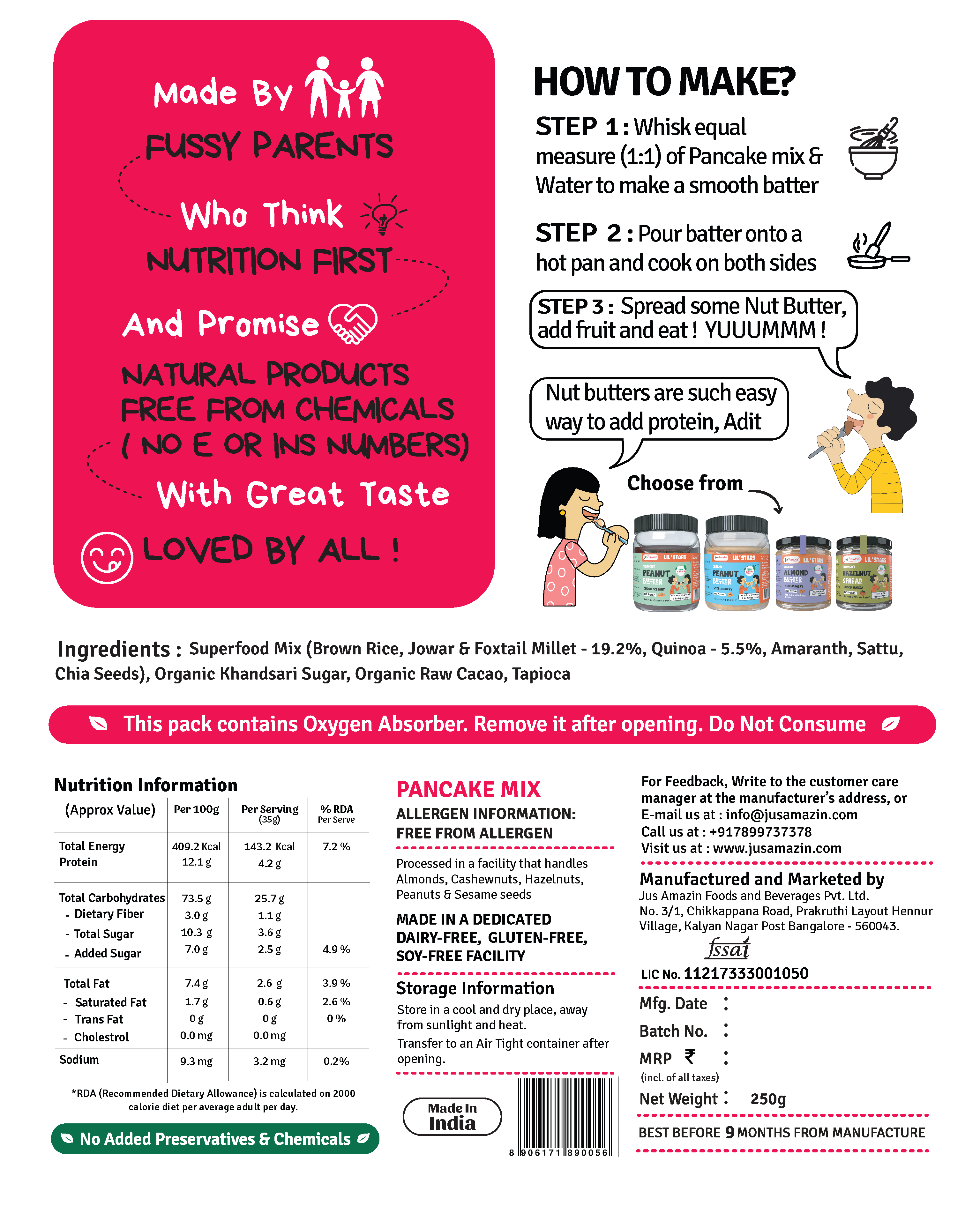
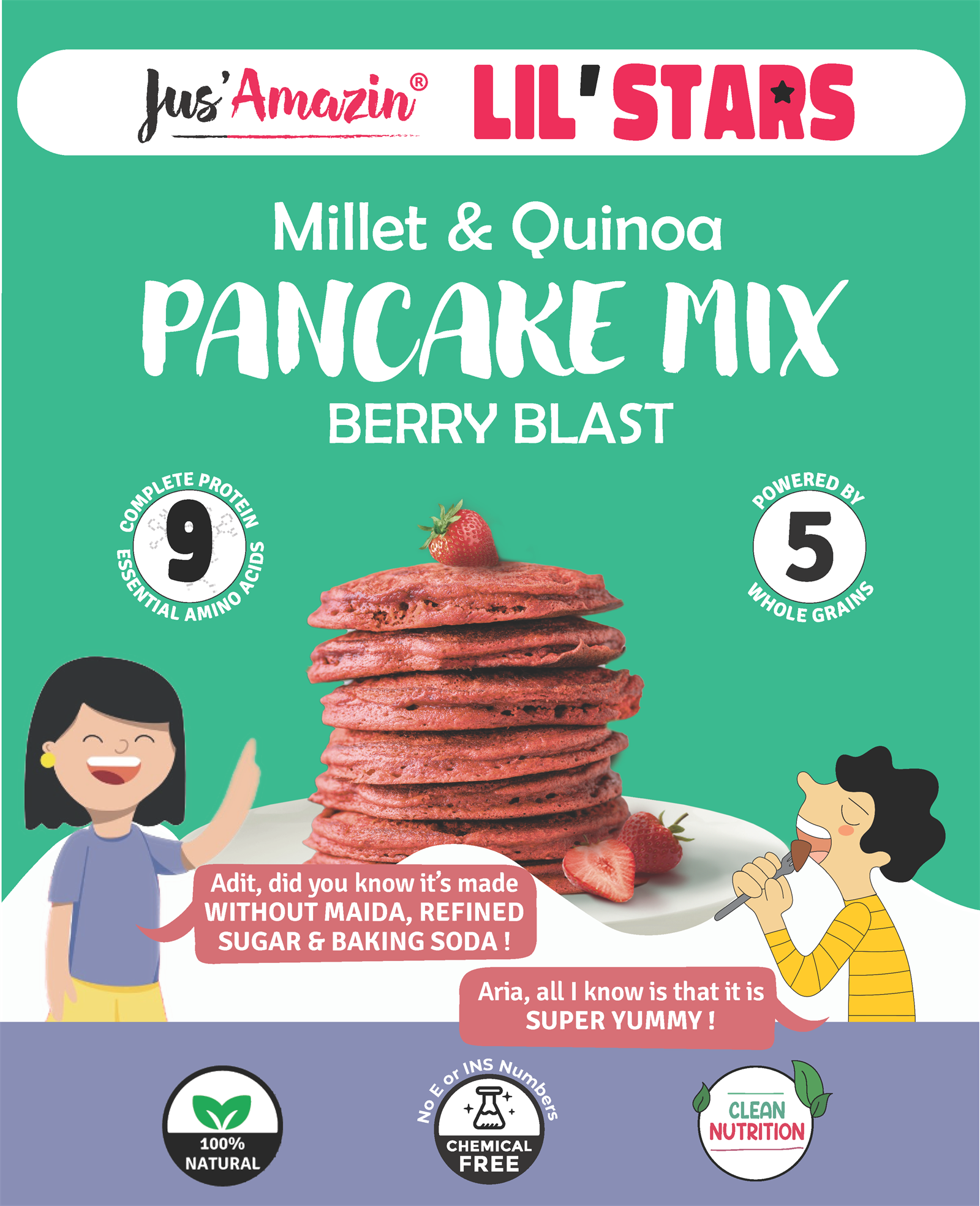
Millet Pancake Mix 3-SKU Suite
Art Direction Note
Clean typography declaring 100% Millets & zero refined sugar balanced with whimsical animal mascot interactions.
Channels
Nature's Basket · Foodhall · Blinkit · Zepto · D2C Store
02
Pantry Spread Lineup
Kids High-Protein Nut Butters
Art Direction Note
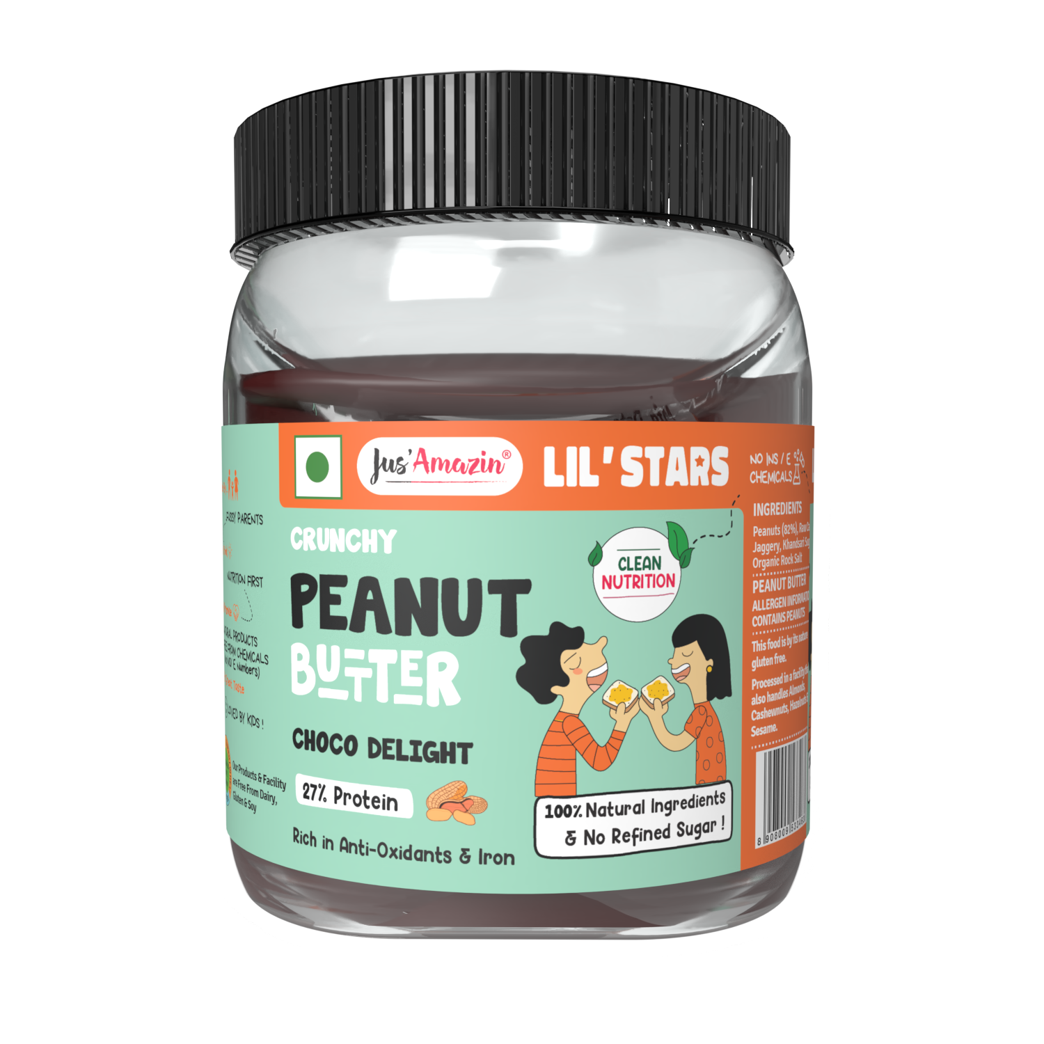
200g glass jar labels featuring organic jaggery, hazelnut milk, and dark chocolate clean spreads with child-friendly color palettes.
Channels
Amazon Pantry · Instamart · Organic Specialty Stores
03
Generative Social Motion
Veo Scripted AI Campaign
Art Direction Note
Scene-by-scene scripted cinematic prompt architecture for Google Veo AI, choreographing pancake flipping, batter whisking, and character motion.
Channels
Instagram Reels · YouTube Shorts · Meta Ads
Performance Dashboard
LAUNCH SKUS
3 SKUs
Millet pancake mixes formulated, designed, and launched in national retail.
SPREADS EXPANSION
4 Flavors
Kids clean nut spreads integrated into unified sub-brand portfolio.
CLEAN CLAIM
100%
Clean millets & zero refined sugar highlighted front-of-pack without clinical dryness.
Feedback Matrix — Segmented Personas
Leadership
Lil'Stars required a delicate touch — friendly, charming, but uncompromising on our clean nutrition philosophy. Shivaraj nailed that sweet spot.
Shilpa Moglishetty
Co-Founder, Jus'Amazin
Consumer
My kids ask for the bear pancake box by name on Sunday mornings, and I know they are eating ragi and foxtail millets instead of refined flour.
Arun
Parent & Customer
Internal Team
The character expressions and vibrant color blocks brought a fresh, high-energy pop to the entire brand portfolio.
Juhi Singh
Visual Designer
What I'd Do Differently
The characters resonated so immediately that retail feedback showed kids were pulling the boxes from shelves themselves. In future iterations, I would print hidden mini-games and coloring activities directly inside the inner flaps of the pancake cartons.
06
Spatial Architecture · Retail Merchandising · POS & Trade
Spatial Retail
Spatial Retail & Exhibition Architecture
CASE_STUDY_07 // CATEGORY: SPATIAL_&_RETAIL_ENVIRONMENT
TL;DR
Brief: Dominate physical retail floors and international trade expos with structural merchandising assets.
Idea: Engineered 5-foot wooden/acrylic Free Standing Display Units (FSUs), parasite checkout strips, and high-impact international exhibition pavilions.
MY ROLESpatial Design Direction3D CAD & Structural RenderingFSU Production EngineeringRetail Planogram ArchitectureExhibition Pavilion LayoutsVendor Fabrication Oversight
The Brand
Jus'Amazin — Retail Merchandising & Global Exhibition Infrastructure
The Brief
Design physical retail display systems that break out of crowded supermarket shelves into high-traffic aisle ends, while creating international exhibition pavilions (AAHAR, Dubai World Trade Centre, Bangalore Habba) that represent clean Indian nutrition on global stages.
The Consumer Insight
In modern trade supermarkets, shelf space is paid by the centimeter, and new brands are relegated to bottom shelves where eye tracking drops by 80%. To drive impulse pickup, you have to own standalone real estate on the retail floor. The physical stand must withstand customer handling, load up to 60kg of heavy glass jars without sagging, and maintain brand hierarchy from 20 feet away.
The Concept
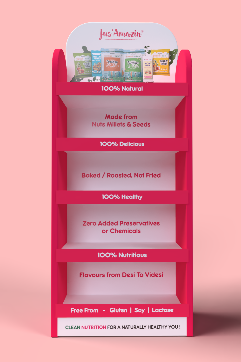
Modular Gravity-Fed Spatial Systems. Designed 5-foot branded wooden Free-Standing Display Units (FSUs) with laser-cut acrylic header signage, angled reinforced shelving for optimal label visibility, and branded parasite hanging strips for checkout aisles. For international expos, designed open-format experiential booths with tasting bars, 3D back-lit product towers, and structured conversation zones.
Strategy — 4 Pillars
01
[CAD_ENGINEERING]
Structural Load Balancing
MDF and engineered composite construction calculated to support 50+ glass jars per tier without shelf deflection, with weighted base plates preventing tipping in high-footfall aisles.
02
[SPATIAL_SIGHTLINES]
20-Foot Eyeline Visibility
Branded top canopy header angles calculated for supermarket aisle sightlines, ensuring the clean food proposition is recognized across a 20-foot radius.
03
[CHECKOUT_CONVERSION]
Impulse Hanging Parasite Strips
Vertical hanging clip-strips engineered for high-density checkout placement, driving spontaneous trials of single-serve sachets and snack cans.
04
[GLOBAL_EXHIBITIONS]
International Pavilion Architecture
Modular exhibition stall architecture deployable at AAHAR Pragati Maidan and Dubai World Trade Centre, combining wet tasting bars, backlit product showcases, and private B2B negotiation lounges.
Where everything started…
— The Iteration Lab · Concept Runway
FILE_ID: POS_FSU_3D_RENDER
5ft Modular Retail FSU Architecture
Detailed 3D CAD modeling and rendering of the freestanding wooden retail display unit, optimizing sightlines and structural load balancing.
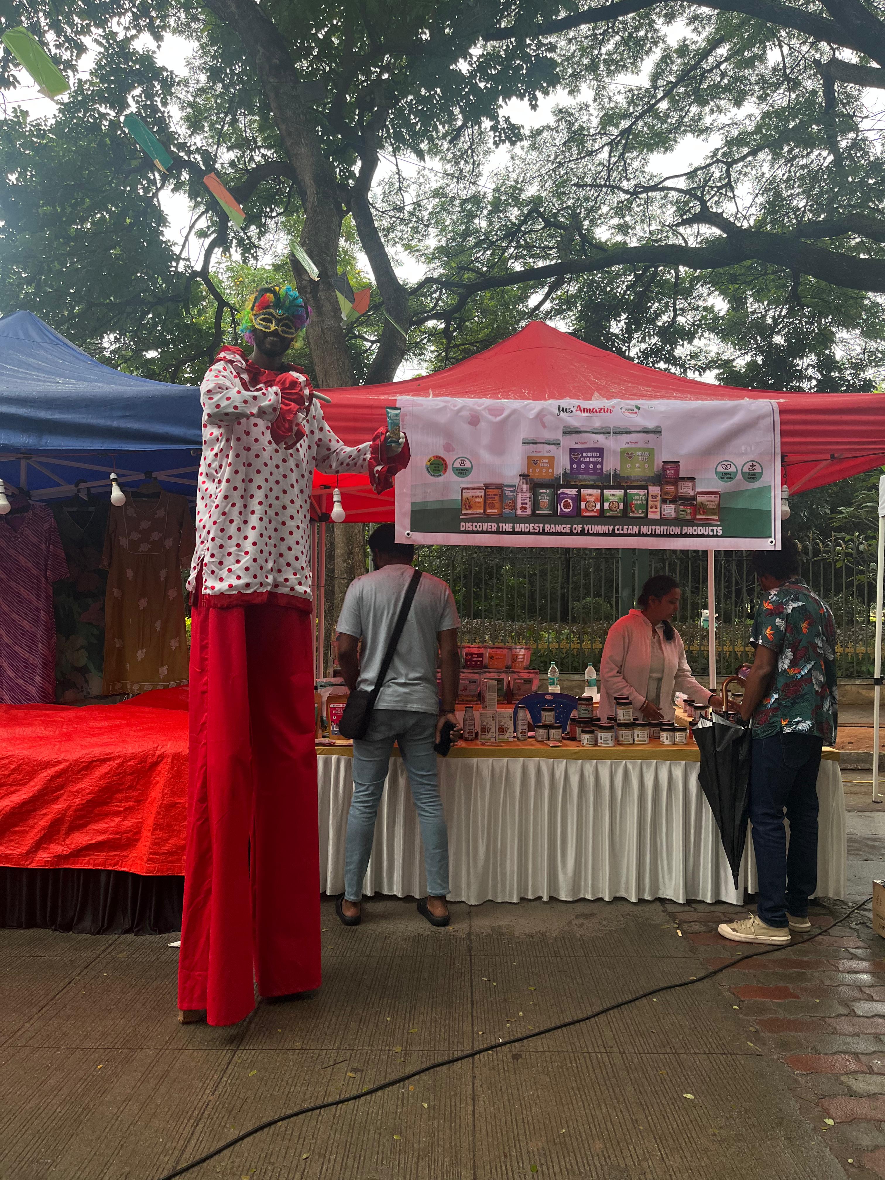
FILE_ID: POS_CARNIVAL_BOOTH
Condo Carnival Pop-Up Booth
Experiential on-ground consumer activation booth designed for high-velocity tasting sessions and direct-to-consumer engagement.
FILE_ID: POS_TRADE_EXPO
International Trade Pavilion Architecture
Exhibition booth layouts for AAHAR and Dubai World Trade Centre, combining product demonstration bars with B2B meeting zones.
My View On This
Packaging does not live in an empty vacuum or a flat Figma artboard; it lives in the brutal physical physics of crowded retail floors and chaotic exhibition halls. When you design a 5-foot wooden FSU, you are engineering consumer footfall, structural weight tolerances, and line-of-sight lighting. Translating brand identity into physical spatial architecture is where design proves its real-world durability.
Execution — Across Touchpoints
01
Modern Trade Floor Display
5ft Engineered Wooden & Acrylic FSU
Art Direction Note
Multi-tier reinforced wooden shelving holding up to 60kg of glass jars, topped with high-contrast acrylic brand canopy.
Channels
Nature's Basket · Foodhall · Spar Hypermarket · Modern Trade Supermarkets
02
International Trade Stage
Dubai & AAHAR Exhibition Pavilions
Art Direction Note
Full spatial build with live product tasting counters, back-lit product display walls, and dedicated distributor consultation tables.
Channels
Dubai World Trade Centre · AAHAR Pragati Maidan · Bangalore Habba
03
On-Ground Consumer Pop-Up
Condo Carnival Activation Booth
Art Direction Note
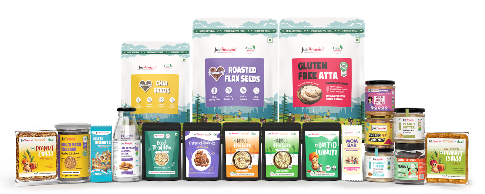
Compact pop-up stall architecture optimized for rapid field assembly, heavy product sampling, and instant conversion.
Channels
Premium Gated Communities · Farmer's Markets · Wellness Festivals
Performance Dashboard
SPATIAL SPEC
5 Feet
Custom freestanding display unit height engineered for optimal eye-level retail merchandising.
TRADE PAVILIONS
3+ Expos
Major international & national trade exhibitions designed and executed (Dubai WTC, AAHAR).
LOAD TOLERANCE
60kg+
Structural shelf load capacity engineered for multi-tier glass jar displays.
Feedback Matrix — Segmented Personas
Internal Team
The freestanding display units secured prime end-cap placements in Nature's Basket and Foodhall that ordinary shelf placement could never match.
Roshan Kulranjan
Business Operations Head
Consumer
The Jus'Amazin booth stood out at AAHAR with clean wooden textures and modern lighting — it looked like an international organic brand.
Trade Exhibition Visitor
Global Food Distributor
Internal Team
The modular FSU assembly was fast to transport and build on site, saving us days during retail rollouts.
Manoj
Production Head
What I'd Do Differently
Physical retail is uncompromising. A display that is hard to assemble or wobbles under weight fails immediately. If I could add one element to future retail units, it would be integrated NFC tags or QR digital dispensers right on the shelf edge so customers could instantly view farm-sourcing stories.