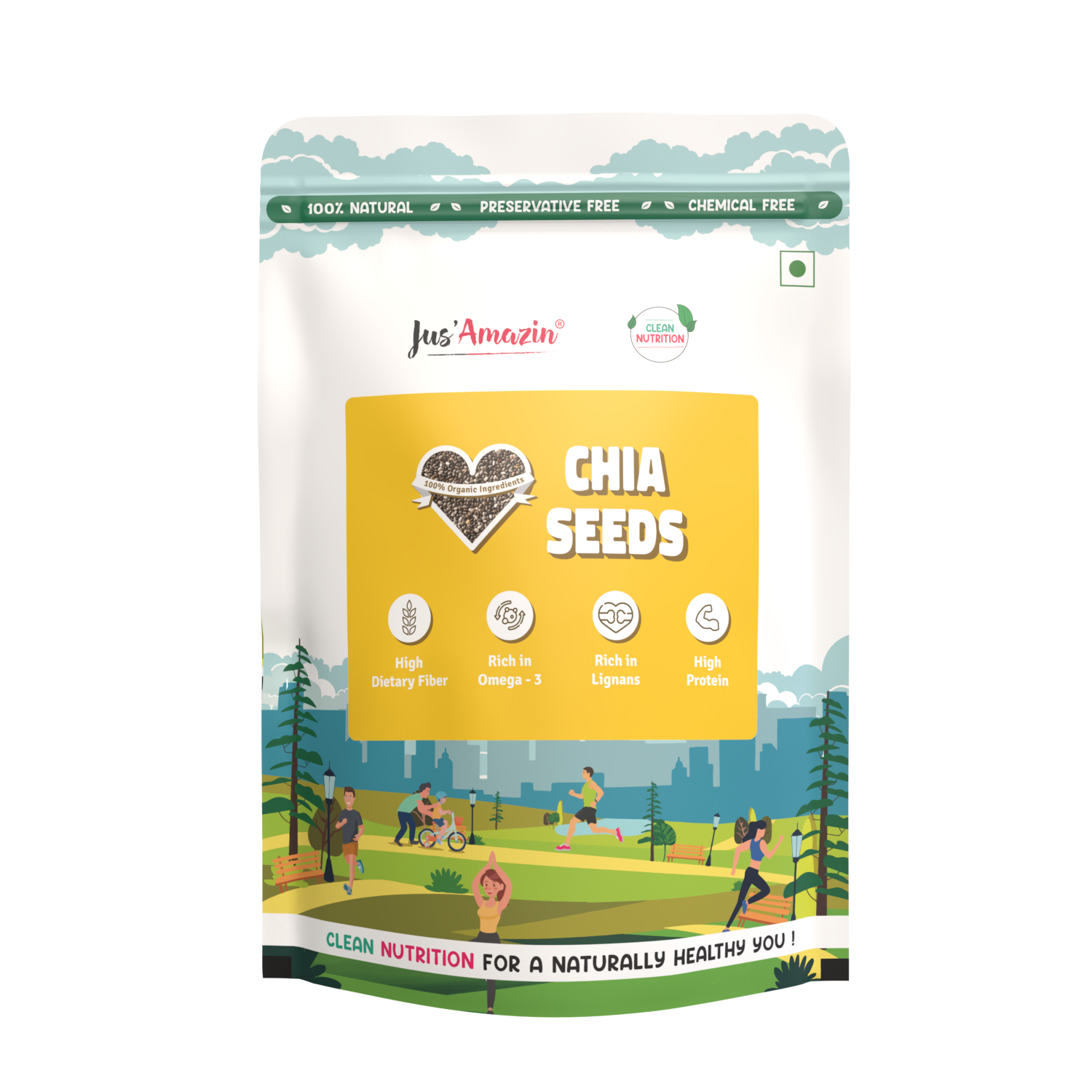
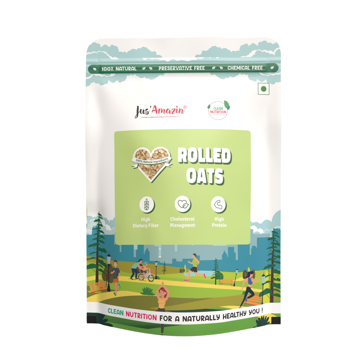
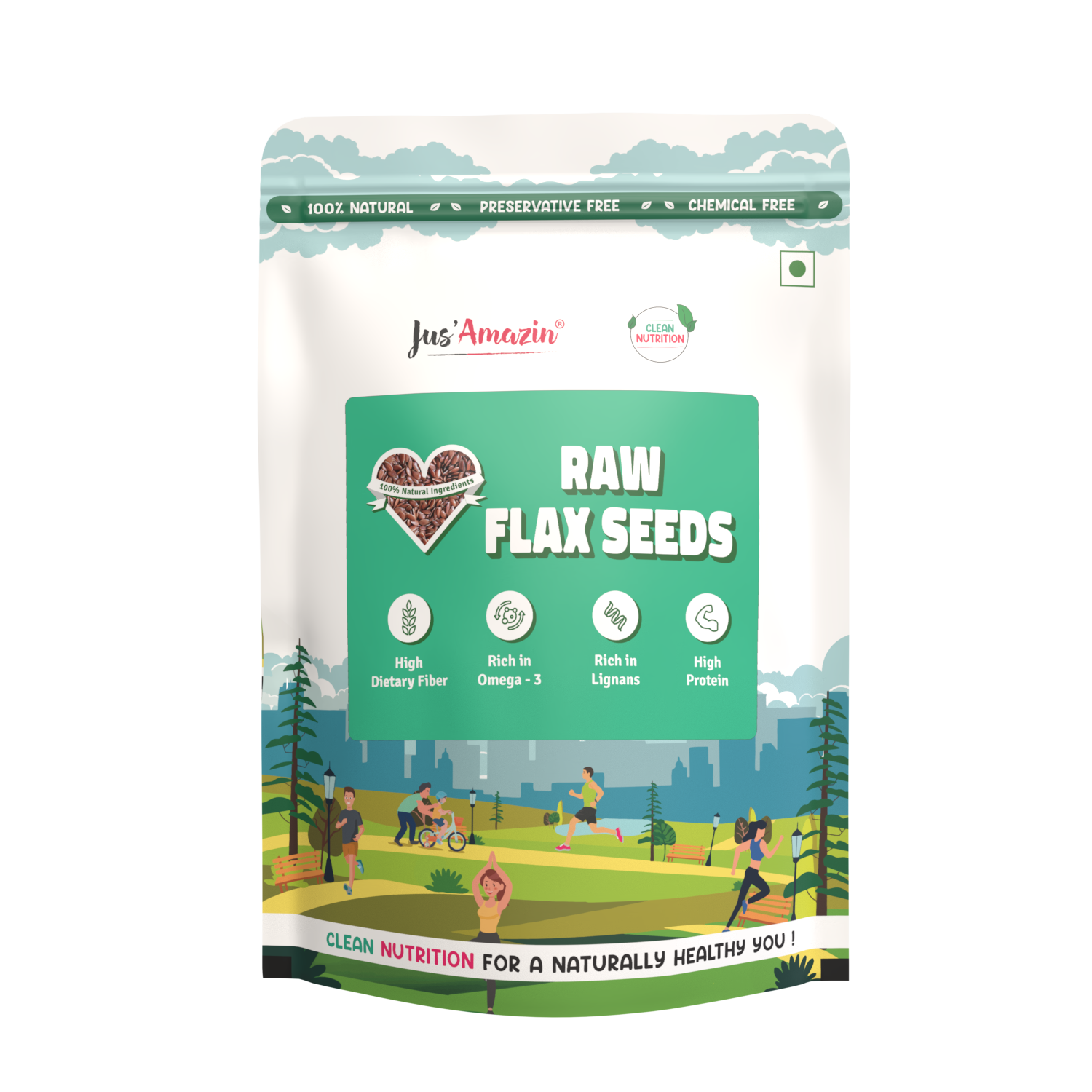
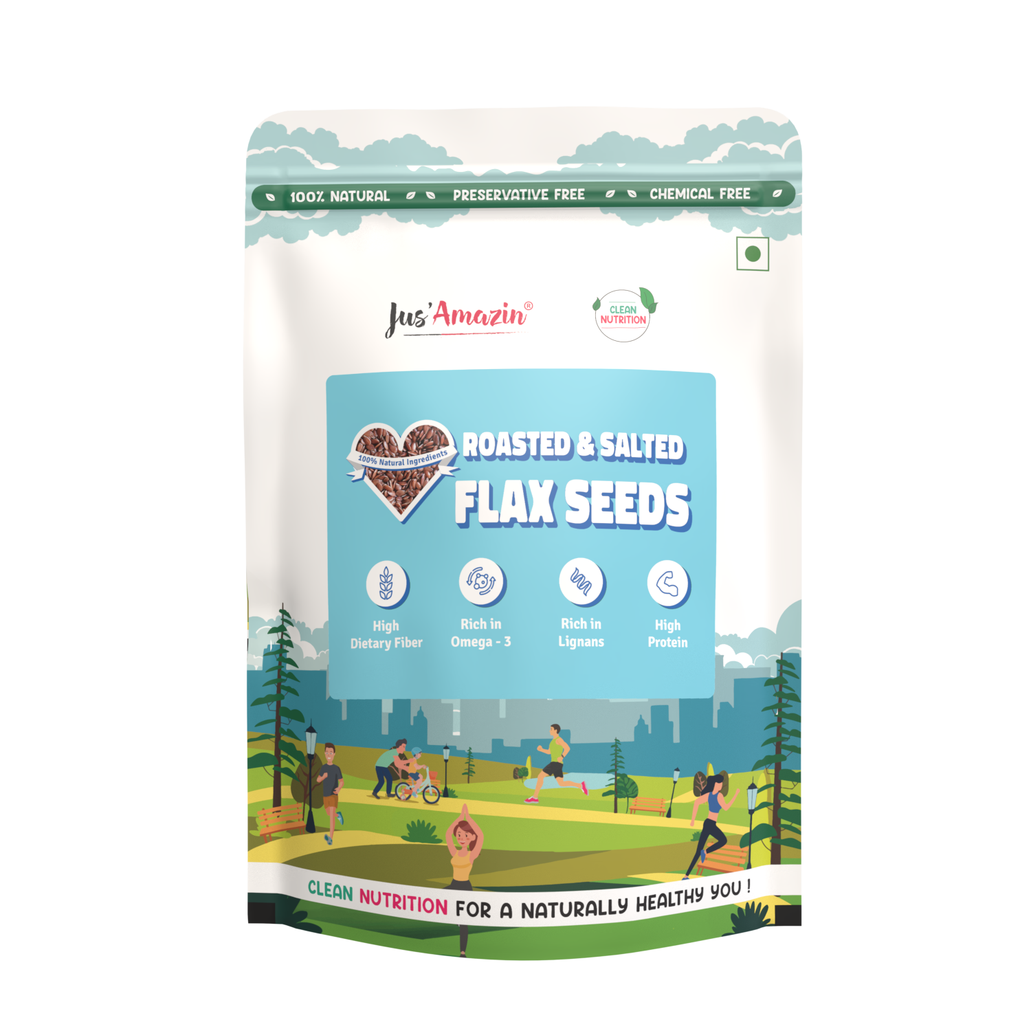
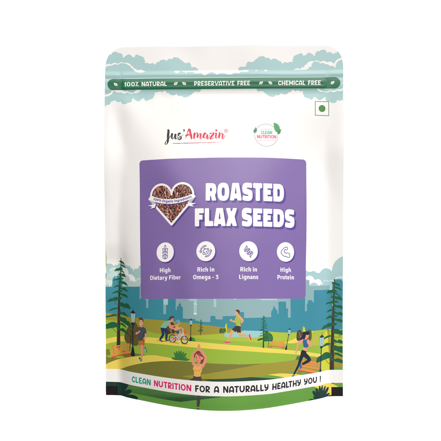
Superfoods
RangeRe-engineering the 500g and 1kg flexible pouch product lines. Merging dense nutritional data with premium visual cleanliness.
Precision.
The regulatory and typographic framework that governs every millimeter of the superfood packaging system.
SFBP Inception
The Superfood Back of Pack (SFBP) project targeted the complete re-engineering of the 500g and 1kg flexible pouch product lines. The mandate was to merge intense informational density with premium visual cleanliness.
Typography Rule
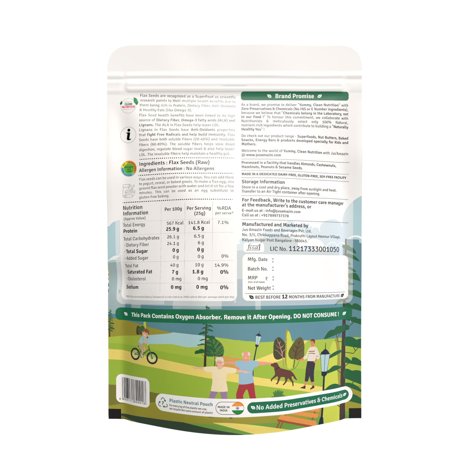
Pivoting away from unstructured mixed casing. Implementing a strict design logic using lowercase nomenclature for ingredient variables and clean ampersand symbols to guarantee visual rhythm.
Regulatory Logic
Meticulous parsing of typographic space — removing stray punctuation marks from headers like 'Ingredients' and 'Allergen Info' to eliminate visual clutter and ensure absolute compliance.
Compliance Scaling
Optimizing layout parameters to successfully integrate updated commercial directives, extending certified shelf life from 9 months to a full 12 months.
Adjustments.
| Parameter | Previous | Target |
|---|---|---|
| Body Font Color | Mixed / Gray | Solid Black for clear shelf legibility |
| Text Spacing | "Super Food" | Unified "Superfood" — single word |
| Key Typographic Casing | Heavily Capitalized | Lowercase: "Flax seed", "dietary fiber", "omega-3" |
| Shelf Life Certification | 9 Months | Upgraded to 12 Months |
Blueprint.
Per 100g standard — verified nutritional artifact panel.
“In consumer goods packaging, accuracy is an aesthetic priority. If a layout lacks structural precision, consumer trust breaks down instantly on the shelf. Every font weight, every casing decision, every regulatory line — it all compounds into either credibility or chaos.”