Desi
Energy
BarStructured Chaos — A Design Manifesto
Pillars.
The strategic framework that guided every design decision — from concept to retail shelf.
A 'Why'?
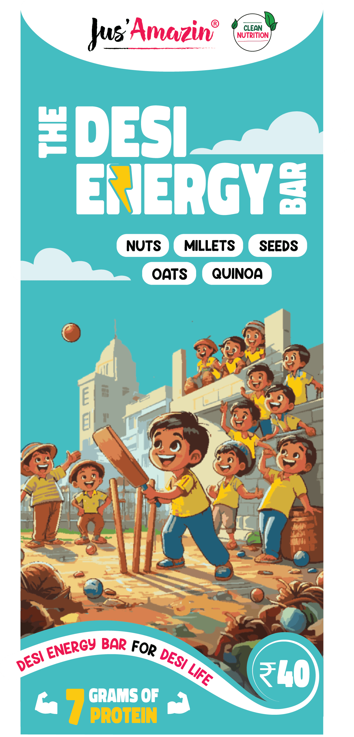
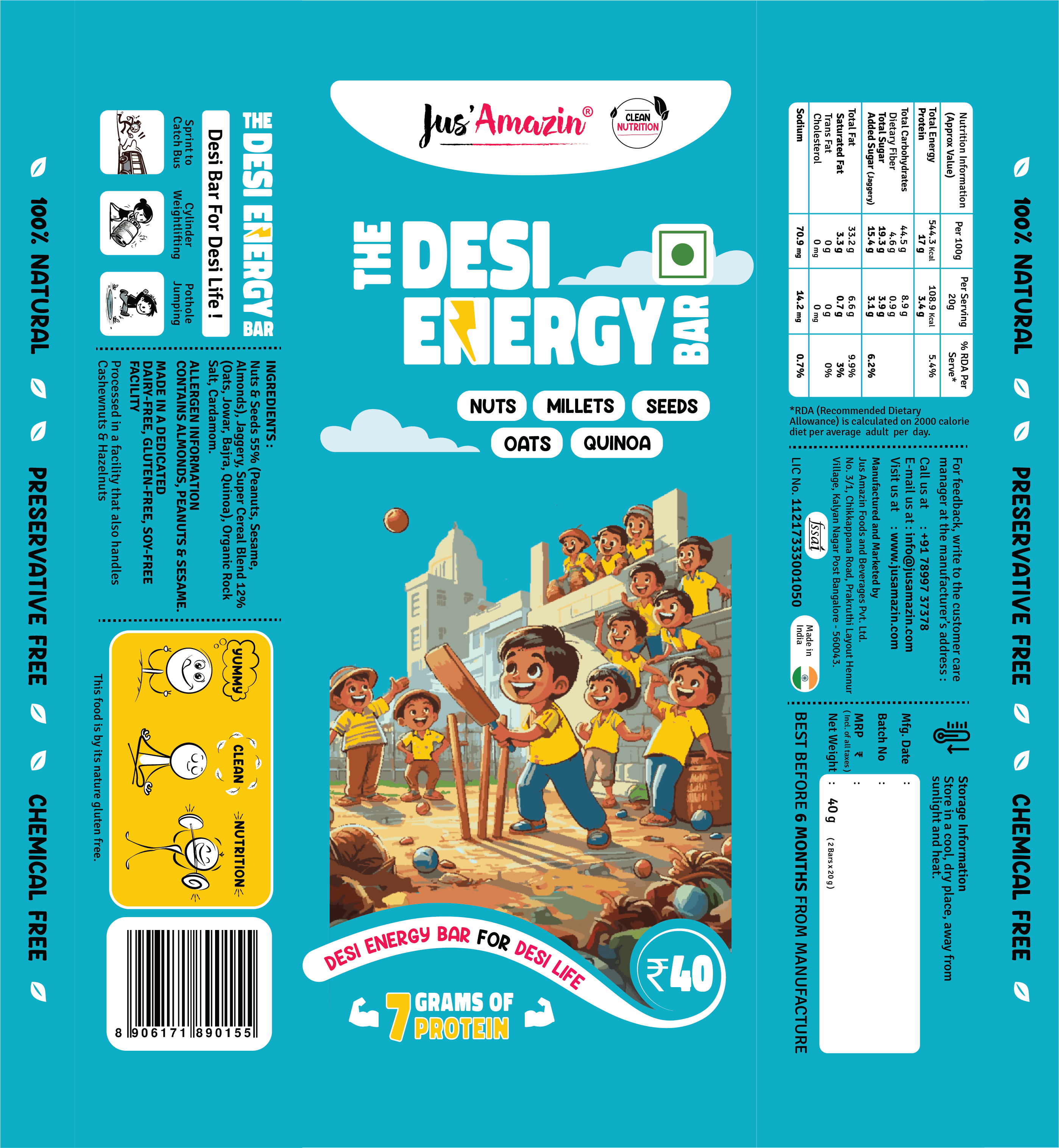
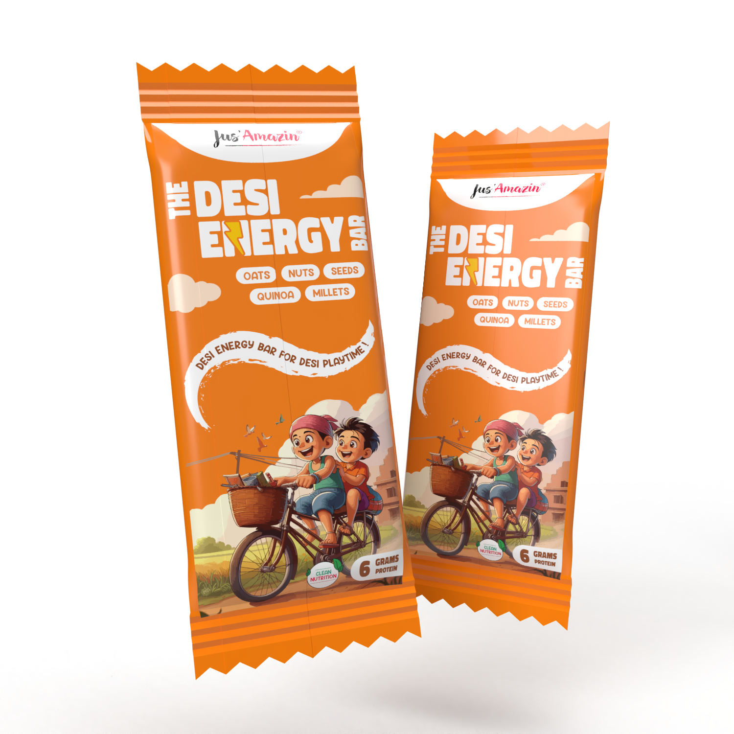
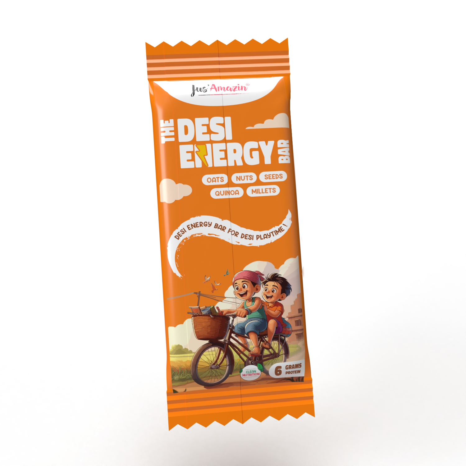
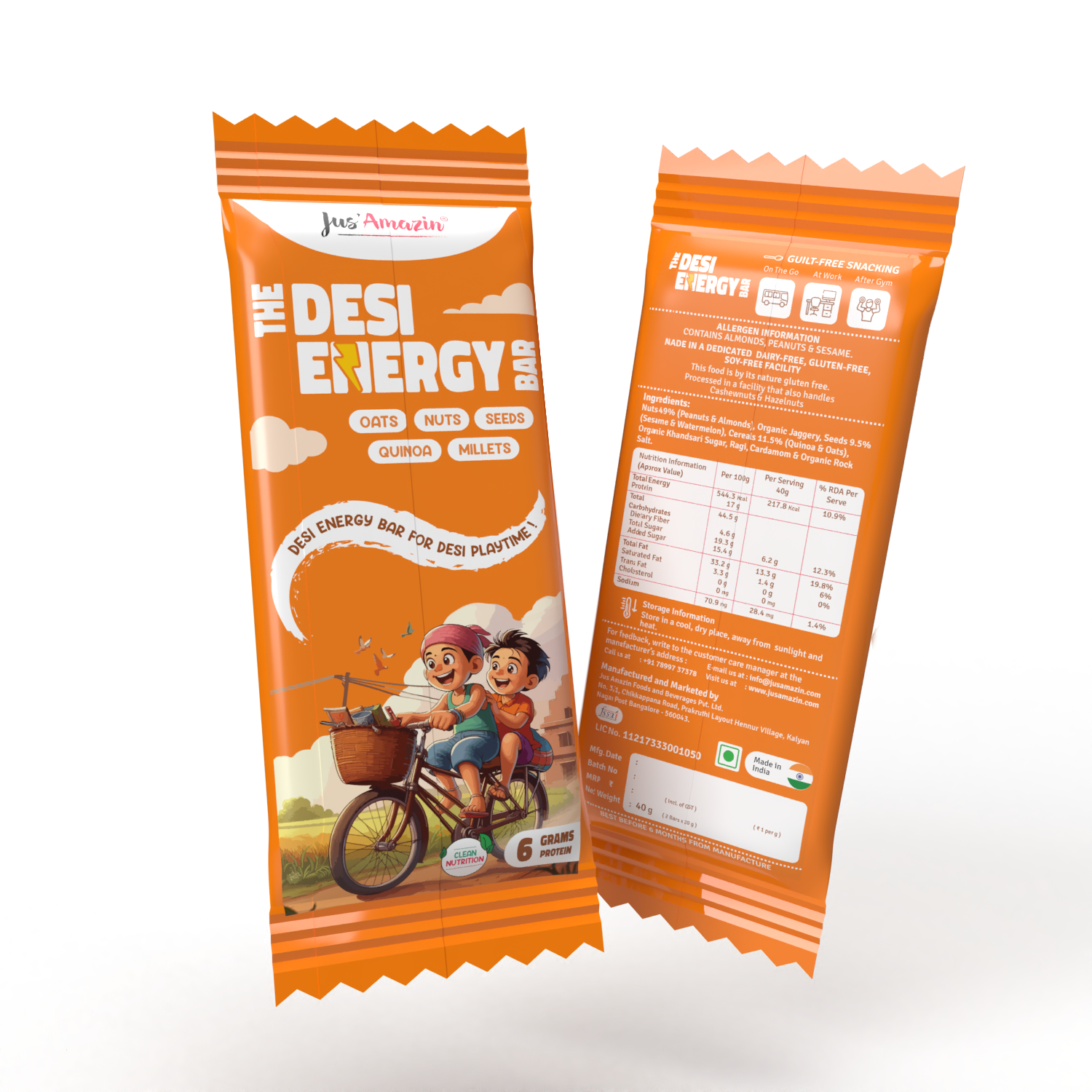
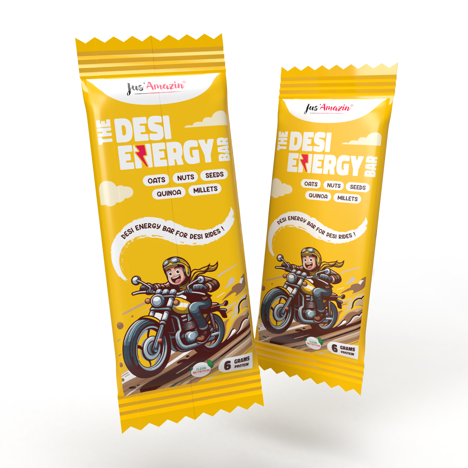
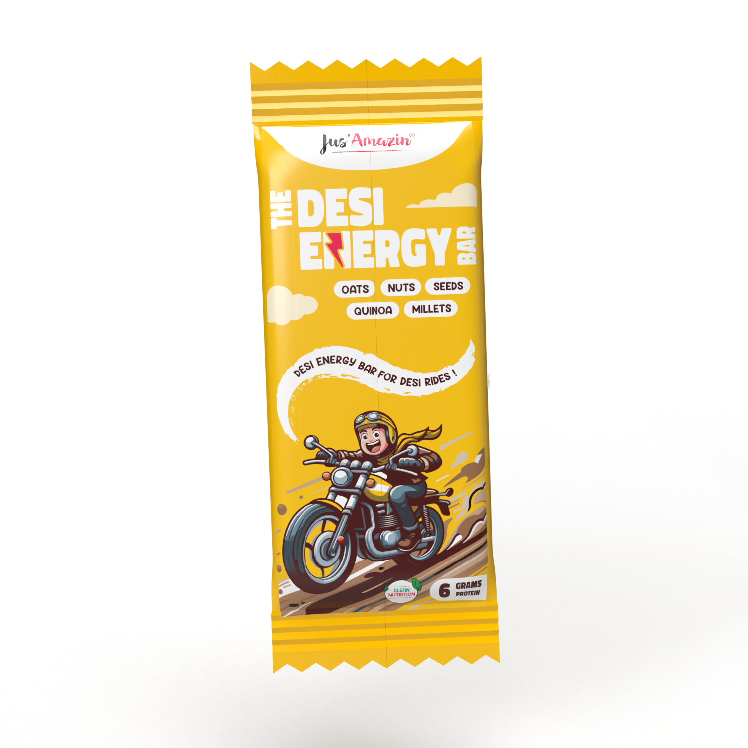
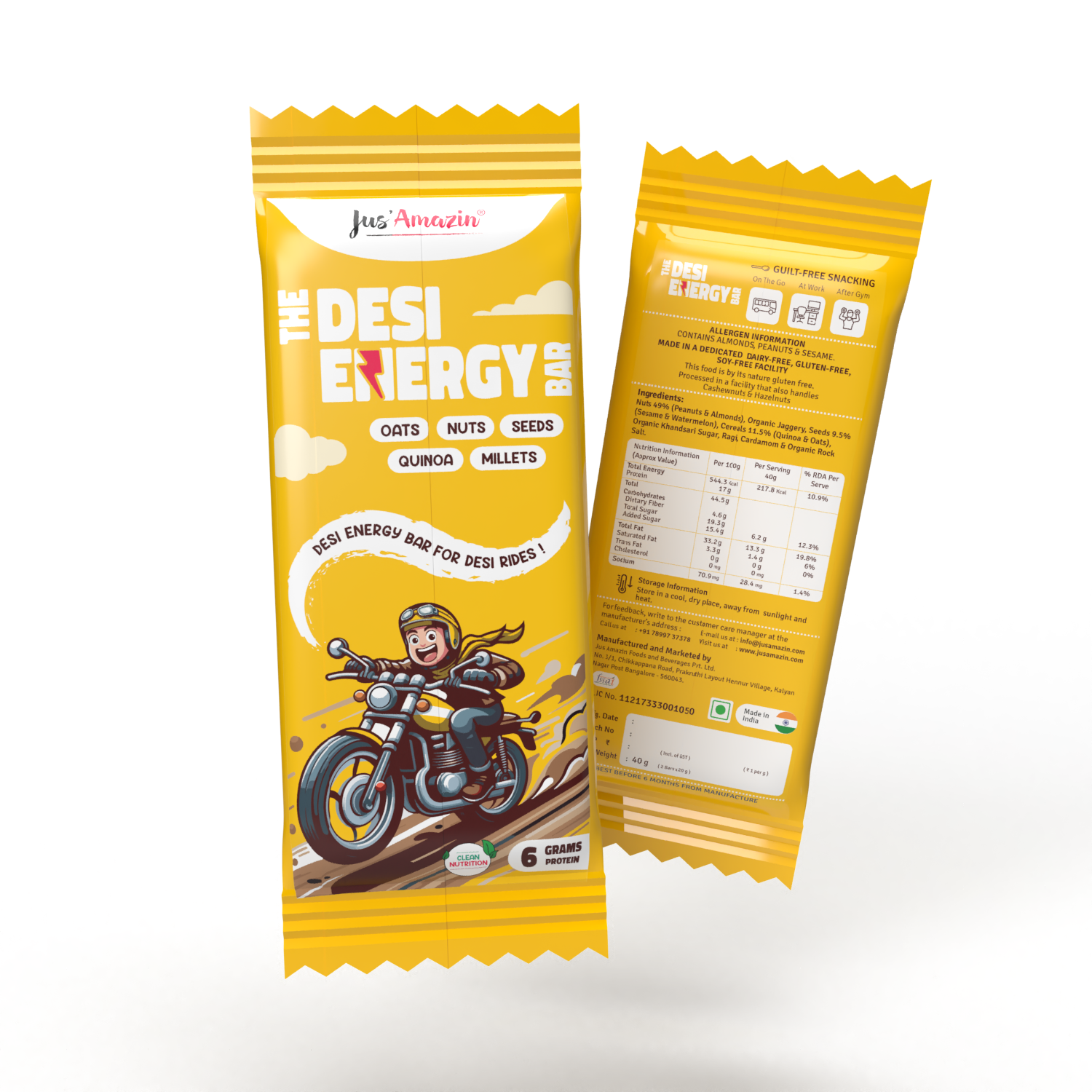
The concept was born from a simple question: Why should health bars feel foreign? This project explores the intersection of Western wellness trends and traditional Indian snacking. The 'Why' behind this design was to bridge that gap — creating a visual and conceptual fusion that honors 'Desi' roots while meeting modern standards of performance nutrition. It's not just an energy bar; it's a fresh, localized take on a global category.
Approach
The objective was to disrupt the saturated health-bar market by pivoting away from 'clinical' western aesthetics and leaning into Indian cultural heritage. My approach centered on Visual Fusion: synthesizing the nostalgic textures of traditional Chikki with the clean, functional cues of modern performance nutrition.
Implementation
In a fast-moving retail landscape, the primary goal was 'Shelf Presence.' I intentionally pivoted away from rigid grid systems to embrace a more fluid, maximalist aesthetic. This 'organized chaos' wasn't a rejection of design principles, but rather a strategic application of Contrast and Color Theory to cut through market noise and create an instant connection with the consumer.
Outcome
The final design resulted in an 'Organized Chaos' — a vibrant, high-energy aesthetic that effectively captured consumer attention within seconds of shelf exposure. By prioritizing emotional connection over rigid design conventions, we created a brand personality that felt both 'Premium' and 'Playful.'
started…
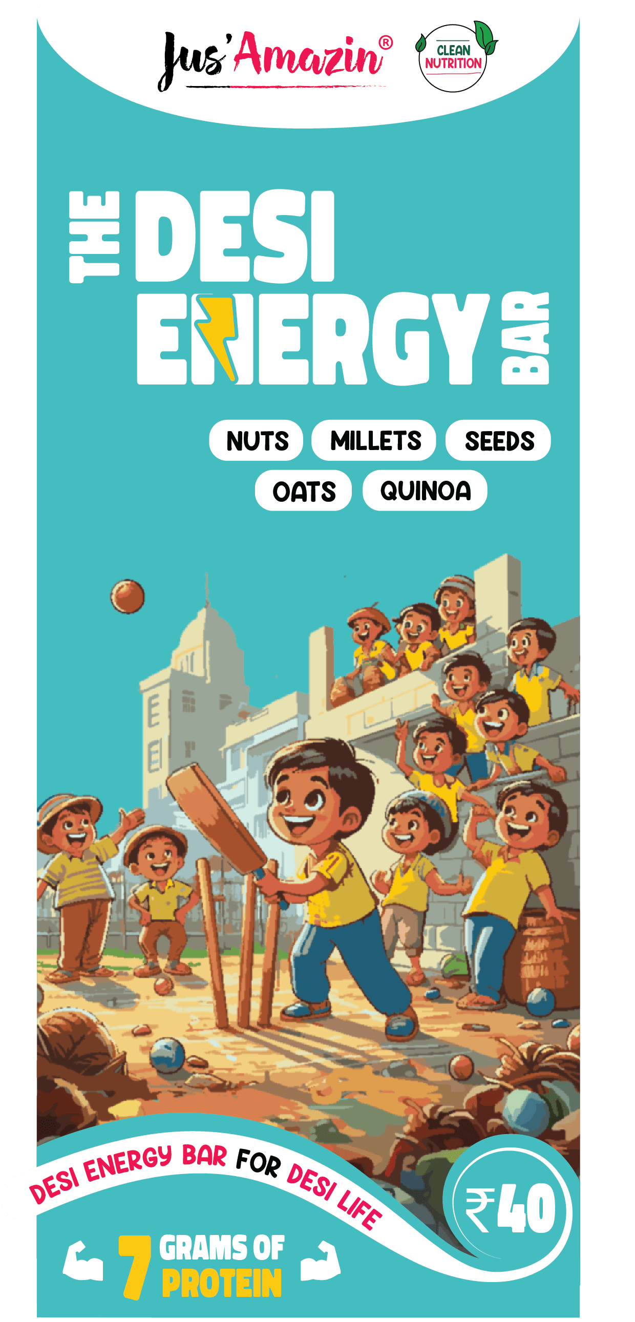
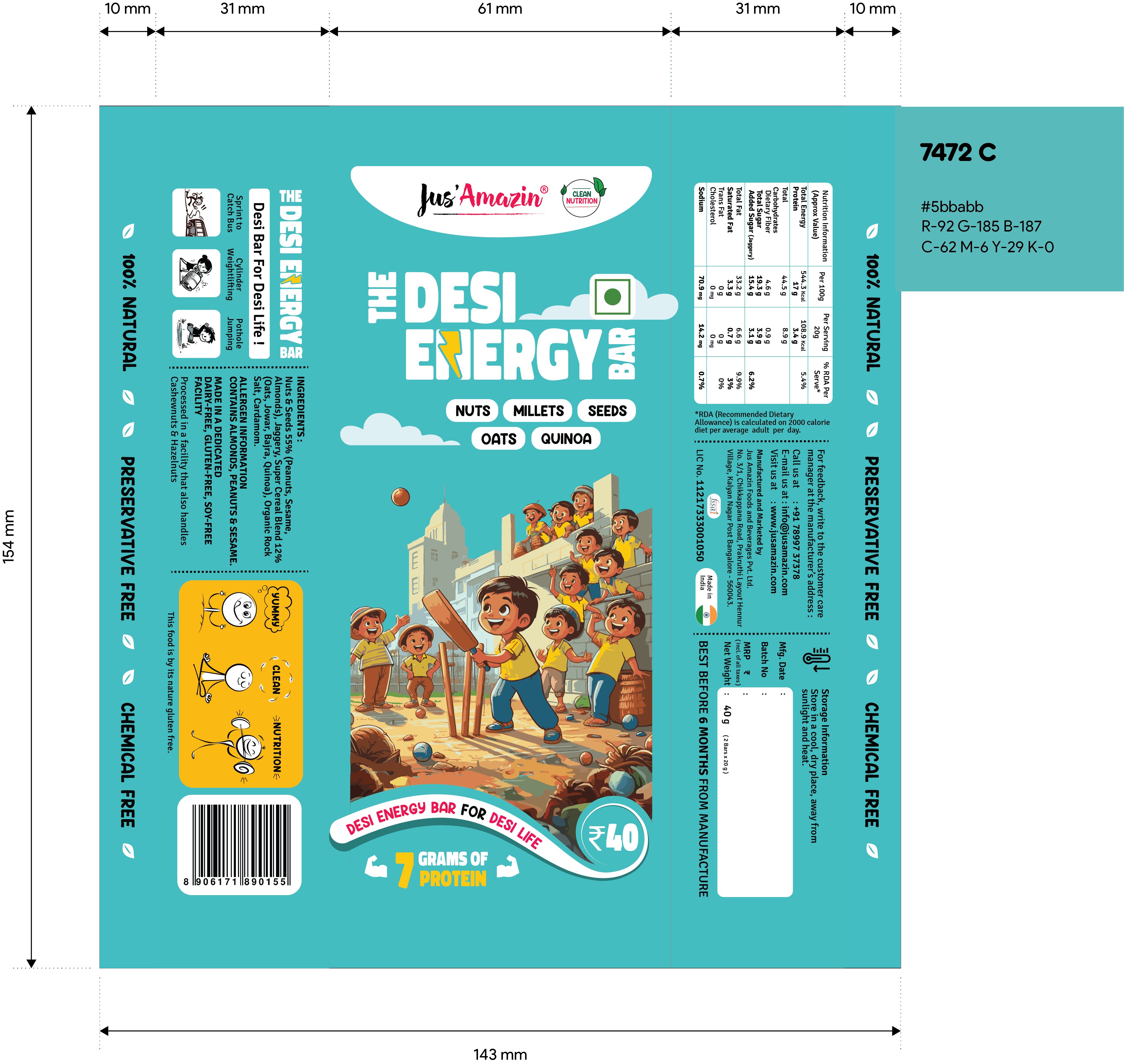
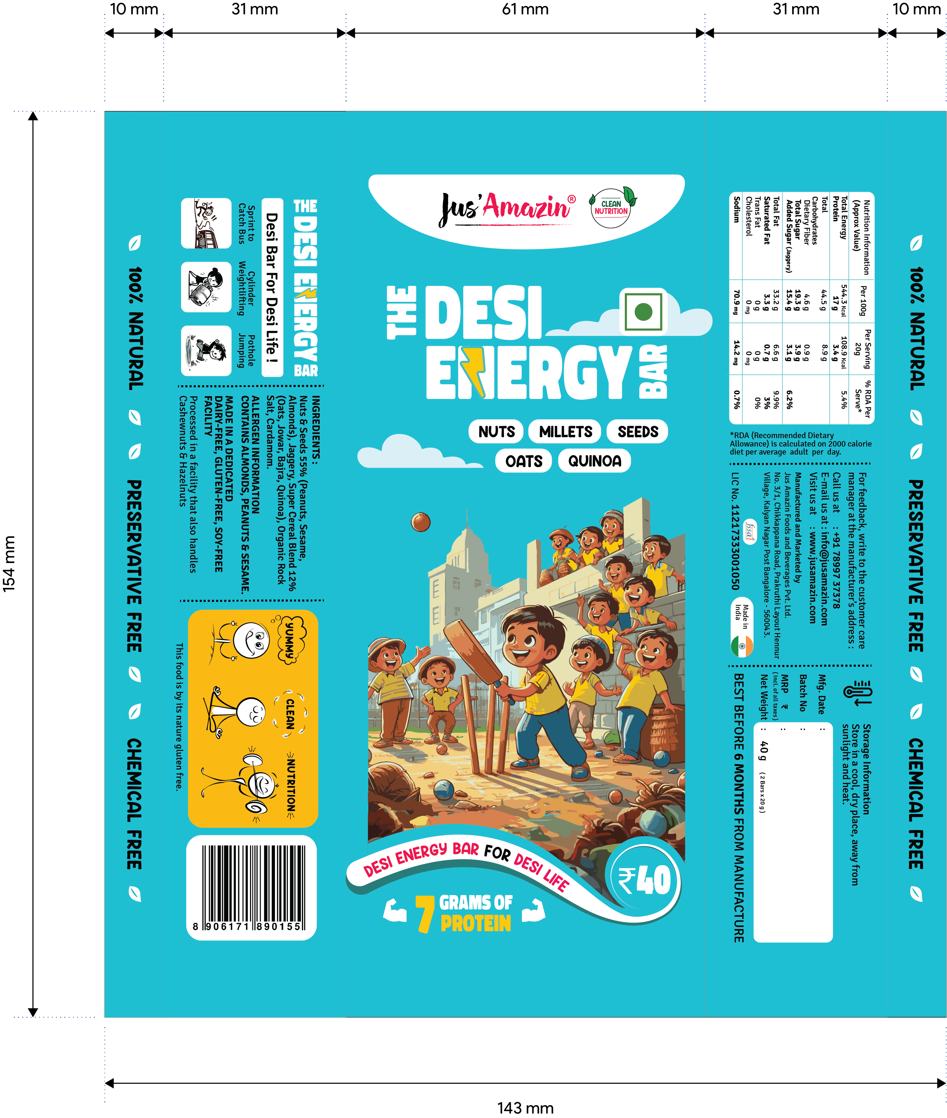

“The core of this project was to capture a specific sensory memory: the post-play 'evening snack' where Chikki was our primary source of energy. While the design evolved to meet rigorous brand requirements, the 'soul' of the product remained unchanged. To me, a successful product isn't just about pixel perfection; it's about the Idea and the Intent. I chose to lean into the 'imperfections' and the meaningful chaos of real life, creating a visual language that feels human, nostalgic, and authentic.”
Impact.
While design creates the first impression, the synergy between the product's quality and its visual identity is what drives retention. By collaborating closely with the production and sales teams, we ensured the brand story reached a diverse audience with maximum impact.
Exponential Sales Growth — Following the visual overhaul, the snacking range saw a 70% increase in sales.
Scalability at its best — Monthly volume surged from an initial 250 units to 3,000 units within the first month. Currently, the product maintains a high-velocity growth rate, reaching 8,000 units per month.
Brand Halo Effect — The success of the Desi Energy Bar increased overall brand equity, driving significant demand and discovery for other product lines within the company portfolio.
Matrix.