Mom2B Care
SystemsDesigning for obstetric trust: replacing medical sterility with grounded, reassuring warmth. Targeted galactagogue functional spreads and the on-the-go Mom Bar.
Imperative.
Mothers navigating pregnancy and postpartum recovery are bombarded with conflicting nutritional advice and synthetic supplements. Mom2B provides an uncompromisingly clean, food-first alternative. The design system focuses on visual calm, transparent claims, and effortless nutrient comprehension.
The Maternal Trust Imperative
Expectant and nursing mothers face intense dietary anxiety and ingredient scrutiny. Packaging in this space too often defaults to either sterile medical clinic aesthetics or generic baby imagery. Mom2B replaces both with grounded, reassuring warmth — clean typography, calming earth tones, and transparent clinical credibility.
Functional Nutritional Hierarchy
Engineered front-of-pack claim hierarchies that immediately communicate essential maternal benefits — natural galactagogues for lactation support, high iron, plant-based calcium, and omega-3 fatty acids — without triggering regulatory friction or overpromising.
Savory Functional Spreads
Extended the line beyond sweet nut butters into traditional Indian savory profiles, including Peanut & Flax Chutney and Spicy Seed Butter. Designed label structures that convey savory culinary depth while preserving clean-nutrition certifications.
The Mom Bar Format
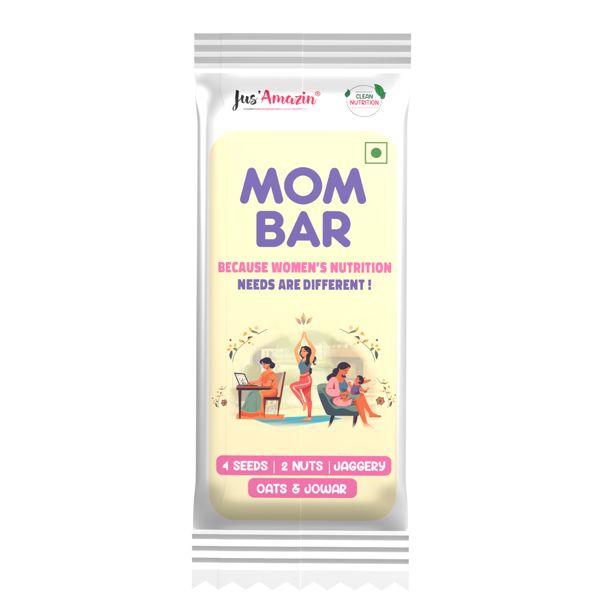
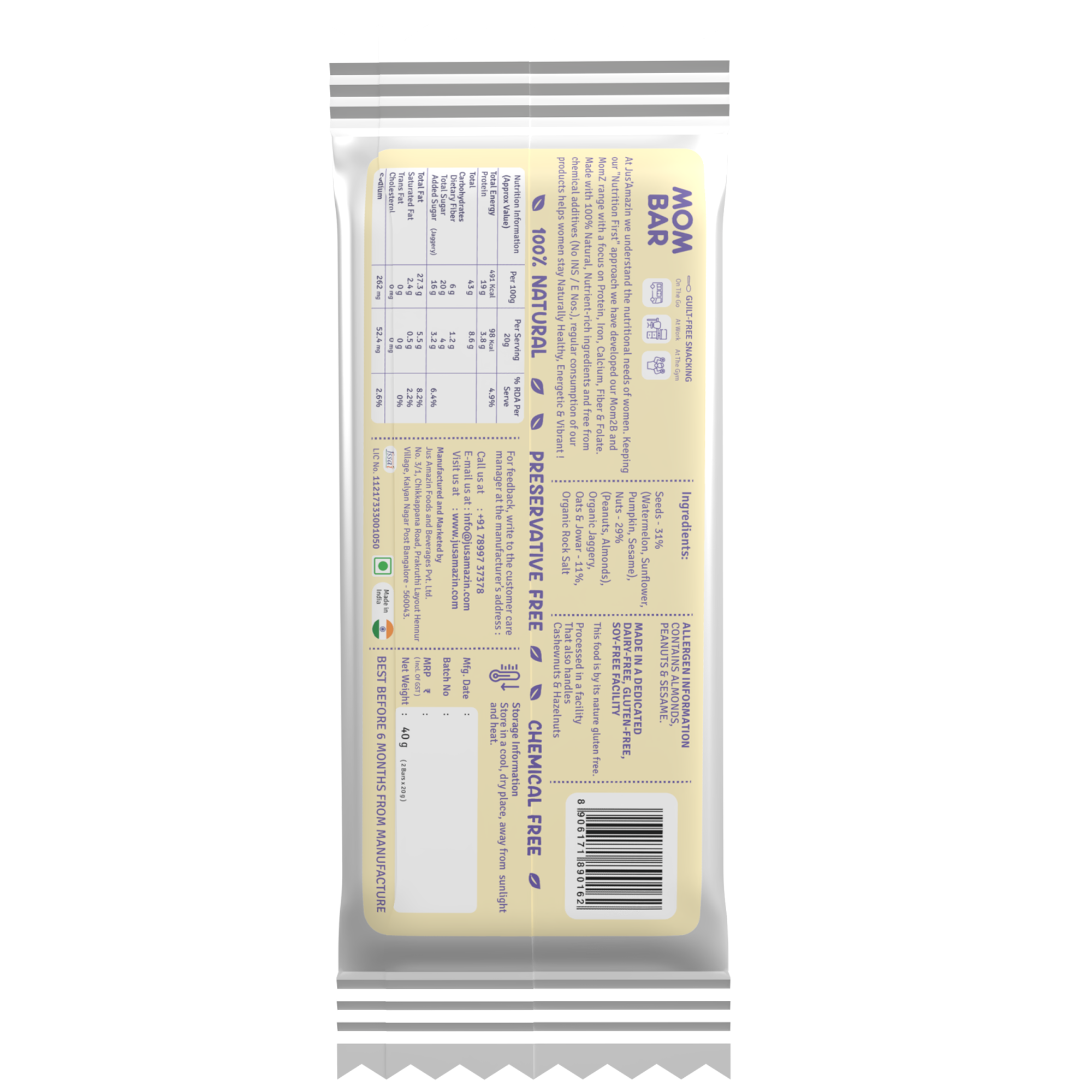
Designed the dedicated flow-wrap packaging for the Mom Bar — an energy and lactation bar engineered for the intense time constraints of new motherhood. Clean structural grid, prominent nutrient callouts, and tactile matte wrapper finishing.
The Mom Bar.
A unified design language applied across 200g glass jars for premium trade, lightweight D2C containers, and the on-the-go Mom Bar lactation bar.




“When a woman is pregnant or feeding a newborn, design is not an abstract exercise. Every line of typography must deliver absolute clarity, emotional safety, and physical ease. Clarity is the ultimate act of empathy.”
Metrics.
Feedback.